Keen Construction - Logo Design
Master Logo
Logo Concept
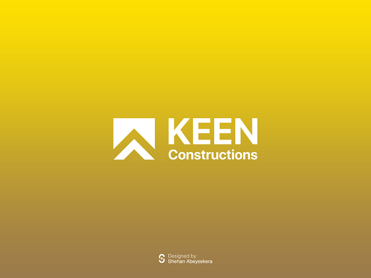
The Keen Construction logo embodies the essence of precision, strength, and vision. At its core, it captures the very essence of the company's commitment to excellence in building.
The focal point of the logo is a stylized roof structure, cleverly crafted from the interlocking forms of the letters "K" and "C", representing the initials of Keen Construction. This design choice not only forms a distinctive visual identity but also symbolizes the firm foundation and structural integrity upon which the company stands.
The clean lines and bold angles of the roof symbolize the company's expertise in construction, evoking a sense of reliability and professionalism. The upward slope of the roof signifies progress, growth, and aspirations towards reaching new heights in the construction industry.
The choice of colours adds depth and sophistication to the logo. A harmonious blend of strong, earthy tones reflects the company's connection to the natural environment and its commitment to sustainable building practices. The subtle gradient lends a modern touch, suggesting innovation and forward-thinking.
Overall, the Keen Construction logo is a powerful visual representation of the company's values, expertise, and dedication to delivering superior construction solutions, making it an instantly recognizable emblem in the industry.


