Sales Dashboard | CRM Dashboard


Greetings!🙏
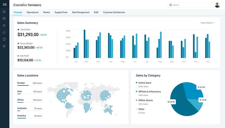
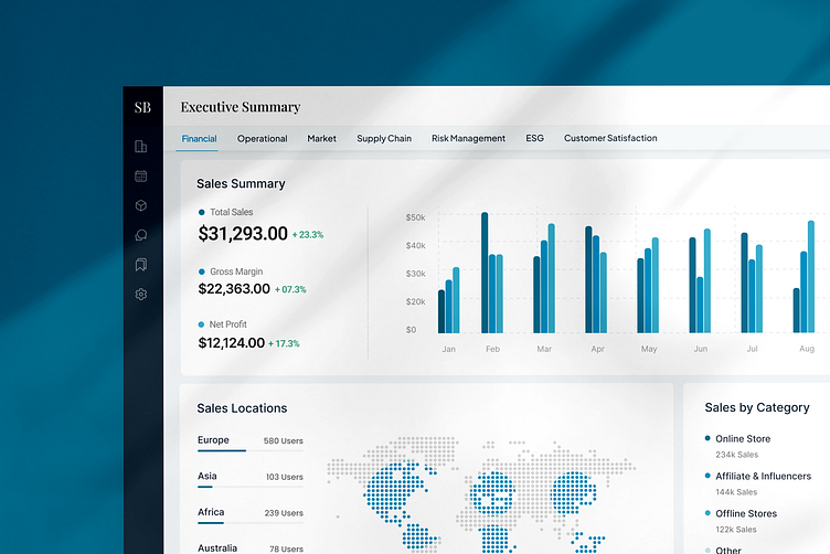
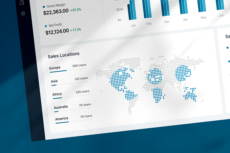
Check out this preview of the CRM sales dashboard! On this screen, you'll find a CRM section called the executive summary, which gives you a quick overview of the most important stuff
A CRM needs to have a clean and neat look for a few reasons.
Firstly, it makes it easier for users to navigate and find what they need quickly. When things are organized and tidy, it's simpler to understand and use the CRM effectively.
Additionally, a clean interface reduces clutter, which can otherwise be overwhelming and distracting.
Lastly, a polished appearance reflects positively on the professionalism and quality of the CRM software, instilling confidence in users that they're working with a reliable tool.


New CRM page designs are on the way! Which page would you like to see first? Let me know in the comments below.
If you require the full version Figma file, please comment or contact.
✉️ Have a project idea?
I'll provide a prompt analysis along with a complimentary proposal.
Rest assured, your information is safe and confidential. :)
🖼️ UI Design | 😄 UX Design | 🎉 Illustration | 🛍 Brand Identity | 📝 Graphic Design | 🌐 Web Development | 📱 Mobile App Development | UX Consultation

Thanks for watching , See you next time ❤️
Follow me for more!