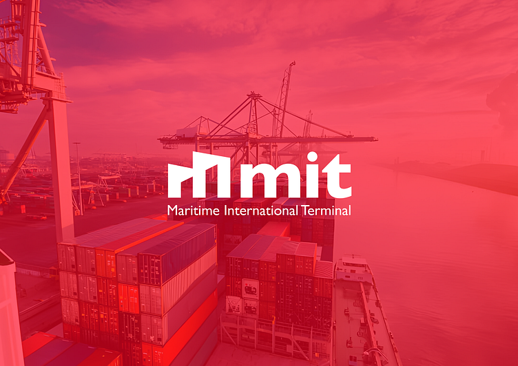
Re-Branding Maritime International Terminal Company Logo
MIT logo embodies the essence of efficient maritime logistics. The iconic shape of a container terminal portainer, sleek and dynamic, symbolizes the core operations of the ship terminal handling company. Logo stands as a beacon of strength, proficiency, and reliability in the bustling realm of maritime commerce.
The color palette I selected for the logo design embodies both the depth of the ocean and the distinct identity of your company. The deep blue hues are chosen specifically to evoke the vastness and depth of the water, symbolizing the expansive reach and capabilities of your maritime operations.
brandidentity
branding
brandingexperts
brandingsolutions
brandstrategy
cargo
creativebranding
designinspiration
graphicdesign
graphic design
logo
logodesign
marinetime
maritimeexcellence
ocean
sea
ship
shipping
visualstorytelling
View all tags
Posted on
Apr 30, 2024
More by Dilhan Dissanayake View profile
Like


