FIT4DON

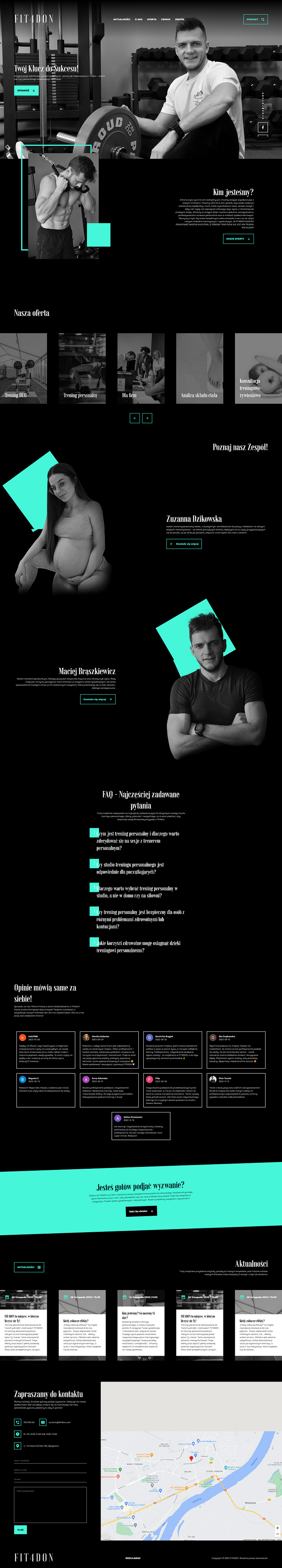

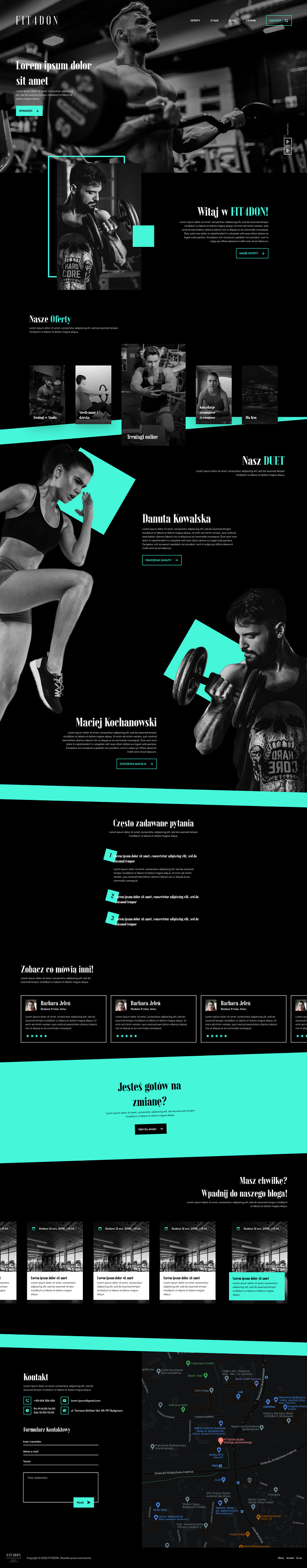
Another offer from my friend to design and cut website. This time for a business offering personal training.
Now THIS is a website I can be slightly proud of. Not only becayse it looks farely clean, but I've also made it in record time 4 days (including cutting).
The only thing that sticks out for me is that on her page the contrast between text and background is too low. Also I could make text on featured posts shorter (the snippet). And finally the numbers on FAQ should be black. The link on the footer was added by their request. They wanted it to be at the bottom, bot on navbar and since it was way after cutting it was kinda akward for me to put it there.
I wanted to use more modern and more fitting font with sport, but they wanted this specific font to be used. Most likely because of their logo...
Ps. Some of the elements were cropped. It's a screenshot of the website.
You can check it here -> fit4don.com