Dalsem

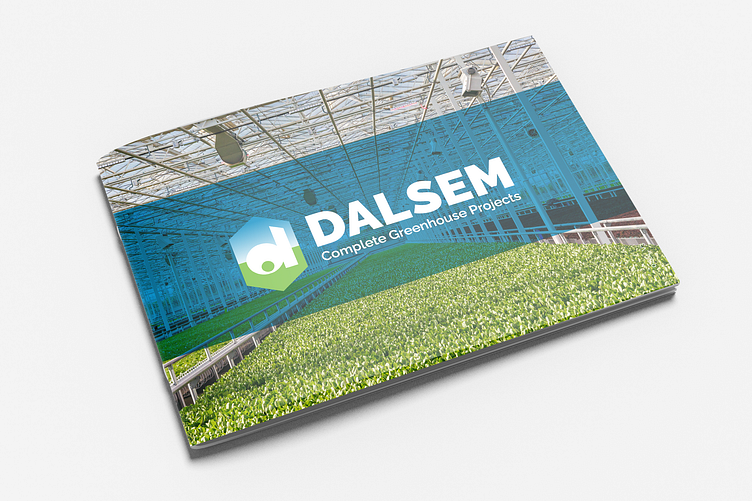
For Dalsem, I was commissioned by the agency JWB to redesign their logo and branding. The logo was outdated, and with the acquisition, they wanted to inject a fresh perspective into it. It was crucial to maintain the essence of the logo to ensure continued recognition among the target audience.
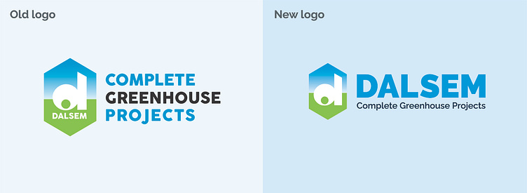
The font originally used was playful but needed to convey a more corporate feel. The emblem and the logo were identical, which proved impractical for various applications. Consequently, we opted to separate them, resulting in the creation of a distinct emblem alongside the company name and slogan.
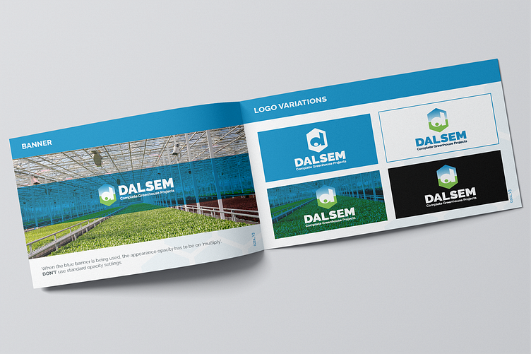
Afterwards, we embarked on creating a new corporate identity. Within the brand book, we documented various elements, including guidelines for when to use specific logo color combinations, approved shapes, colors, patterns, and fonts. Additionally, we outlined which applications were no longer permitted.
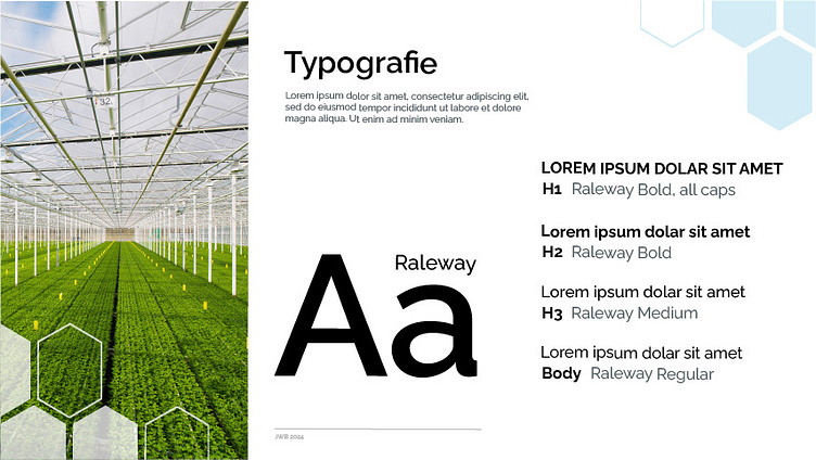
The typography was changed from Coco Goose to Raleway. While maintaining the essence, this shift brought about a more serious tone due to the sharper angles and forms.