CREAMERY - By Namaste India

The ice cream market in India is sized at INR 194.1 Billion. Higher disposable incomes contribute directly to the propensity to indulge and also explore. The RTE segment is the largest, and we can see a steady rise in the artisanal experience that brings in quality and an eclectic personality to the ice cream. Who would think an elder flower and mascarpone would have takers! Though much of the segment is still made up of classic flavours the projected growth of 17% means a lot of brands can cater to the exploration motivated empowered target.

Market Research and Industry Insights
Namaste India already has a wide portfolio in the North Indian market. To create a unique experience for the user, Creamery was targeted at children, young adults and young and old professionals. The scalability being regional focus and Pan India. We studied a total of 18 competitors across India under two categories - brand and store.
Both helped us identify the gaps in the market where we could position Creamery with distinctive qualities. Brand character, visual style, logo types, etc. were analysed to create a discernible brand. Bblewrap conducted detailed on site market research that formed the basis of the brand strategy for Creamery.

Location Analysis
Creamery was to be launched across multiple sites within Kanpur city (Uthar Pradesh). This means we had to consolidate the brand response against various social backdrops. Each of the 5 locations was a dynamic epicentre, situated against various socio-economic factors. Market dynamics in each location enlist a different type of engagement -easy walking through a mall, a high traffic area, relaxed residence and severe competition. Study of each site helped in toning up and down the brand elements in aspects of aesthetics, visual vehemence and overall design to match all types of customers.
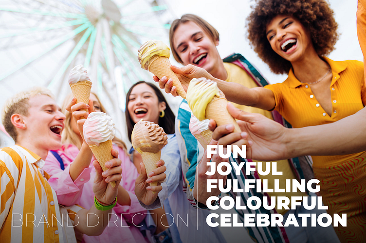
Brand Direction and Strategy
About 18 competitors were analysed to identify the gap in the visual aesthetics of the brand. Various parameters like the in-store experience, communication design style, graphic voice, the moods induced by colours, brand colours and package design were analysed to arrive at a brand direction that adopts a very Indian yet present-day trend that involves the brand being a celebratory, vibrant, fun, joyful and fulfilling enterprise. This direction aligns with the brand's offerings and its goals.
The brand strategy was defined keeping three things in mind - interactivity, improved connectivity and building lasting customer relationships through brand engagement. Amplifying brand cohesion, adding brand credibility through all touchpoints, and offering uniform quality at all times were some of the significant brand objectives that were a part of the strategy for Creamery. The strategy also relies on enhancing product visibility and effectiveness through modern design intervention.
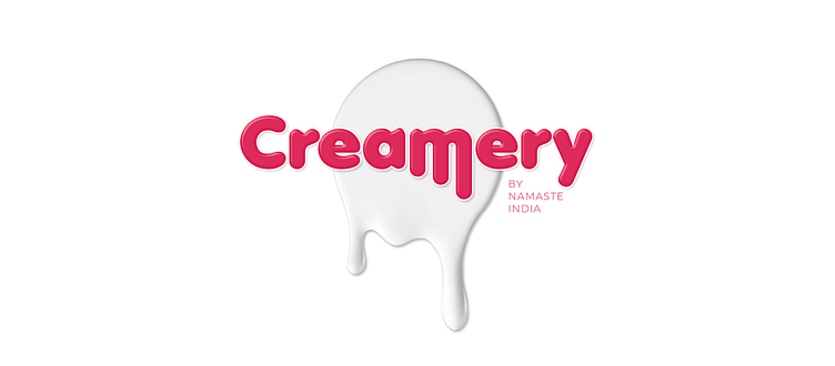
Brand Naming and Identity
A good brand name has to be tested for technical and trademarking feasibility. Getting a good fit is challenging in the current marketplace, that’s why brand naming becomes a tactical exercise.
The client wanted a name that exudes the quality of the product. Hence the focus was to find a name that was harmonic, easy to recall and also communicated ice cream first!
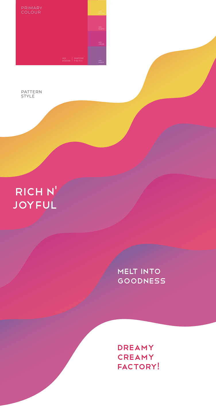
The brand identity of Creamery follows a simplistic yet modern brand that is friendly and celebrates the joy of eating ice cream. The identity allows for expansion through patterns and lends a bold and fun persona with its dynamic pinkish-red. The identity and its extension carry the ability to communicate the quality of the product, elevate emotional engagement and the red is empowering in terms of product category choices presented to the customer. Setting that against softer tones elevates brand connect and loyalty.
Package Design and Brand Collaterals
Ice cream in a cone or ice cream in a cup, each experience is as unique as the customer! With a focus on vibrancy and connection, the package design is resplendent in matching the aspiration of the brand user and communicating fun and ease with a display of colours and the brand. The simplicity of the form is extended to brand collaterals, the colour-splashed t-shirt, tissue papers, invoices and signages.
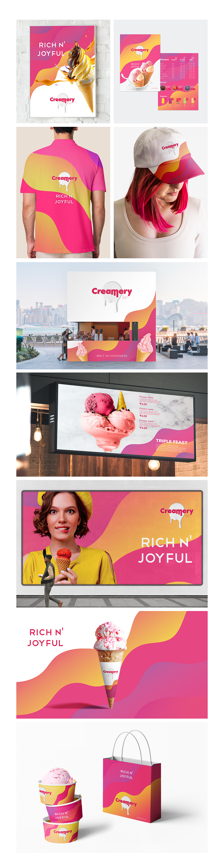
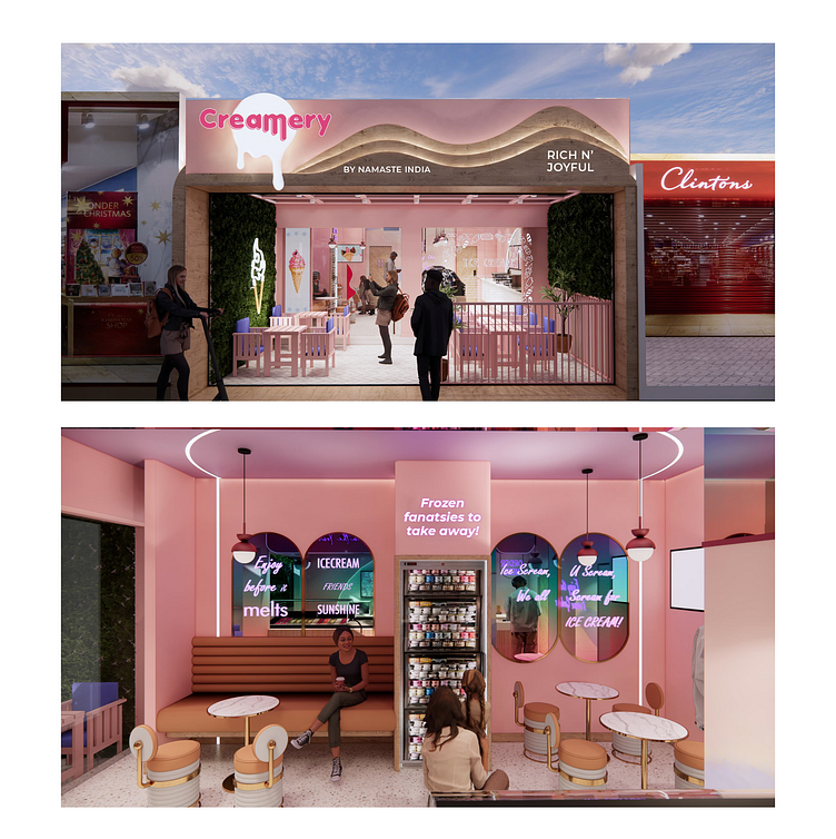
In-Store Graphic Design
The vibrant energy of the brand was translated into modern and very contemporary visual elements that make the creamery cafe a cool place to hang out. The design is friendly and the signages and display are curated to perform in favour of the brand.
The display also allows for a steady visual that invites experimentation. In the digital age, every edible interaction is documented. And that visual advocacy was supported in neon boards and posters.