Adams Street - Rebrand - Graphic Language

Adams Street Rebrand
Adams Street is a global leader in Private Equity investment. Drawing on five decades of market experience, the company has grown to twelve offices worldwide. We updated the Adams Street brand to express their confidence, expertise, and position as leaders. We transitioned the strategy into a visual language by creating design principles: “Forward Thinking, Redefining Boundaries, Optimistic, Collaborative, and Expert.” The new brand captures Adams Streets’ deep knowledge and expertise, and position as compassionate leaders.
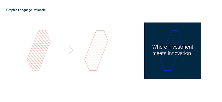
At the center of the brand identity update is a new logo, “The Path.” Tall, dynamic lines look to the future, leading with confidence and optimism, charting the path ahead. Bold, progressive and dynamic design highlight the firm’s forward thinking approach. The bright primary blue color expresses a calm character, optimistic outlook and energetic attitude.
“The path” concept is extended in the environmental photography, creating visual pathways to a subject seen in the central focal point. The cityscapes are modern and light, presenting an optimistic outlook. The design is elevated, minimal and sharp to highlight clarity and expertise.