Essence Perfume Product Design


Roles
Product Designer, Graphic Designer
Tools
Procreate, Adobe Photoshop, Adobe Illustrator
Introduction
Essence is a perfume product for young women ages 9-16. The goal of this product is to bring whimsy and magic to the world of aromatics while maintaining pure and natural ingredients that are helpful and not harmful to the body. Essence Perfume was established to empowering young women to explore avenues of self expression in wholesome ways.
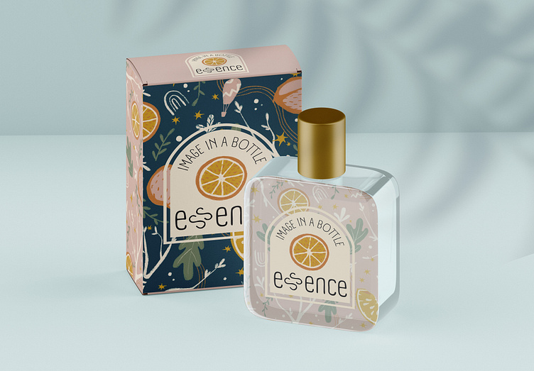
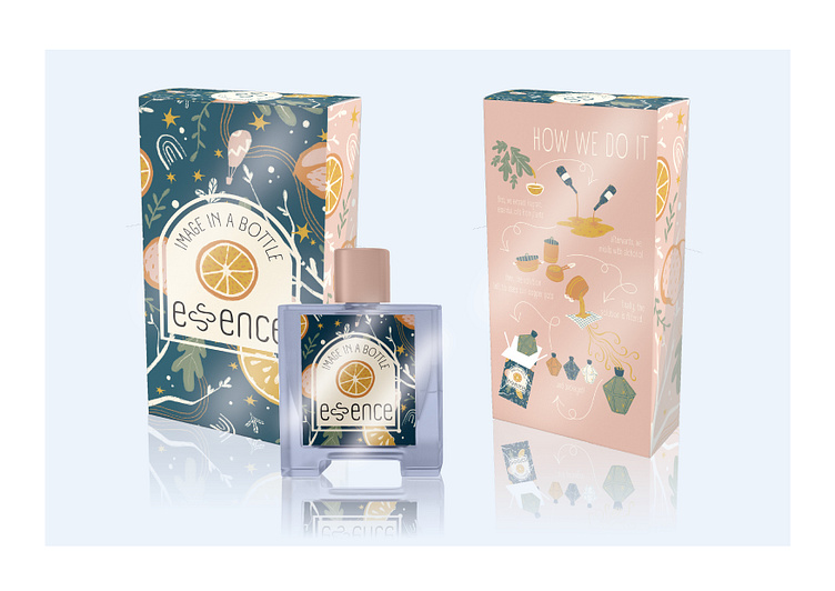
Below: Mockups of the Essence product and packaging
Design Process
Product Needs
Youthful packaging that appeals to a younger audience without appearing immature
Bold and easy-to-read labeling
A visual display of the perfume development process somewhere on the packaging
Execution
A product that has visually stimulating packaging with youthfully stylized versions of traditionally elegant elements ie fruit, branches, stars, etc.
Colors that are soft and yeild to busy patterns
A graphic with the step by step process of perfume development and text to accompany
The use of minimally altered text for the logo, with basic font types
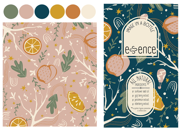
As I was creating the packing for Essence, I focused on establishing the personality of the brand. The colors I chose for the product were warm earth tones of green, pink, yellow and orange, accompanied by a bold navy and off-white for contrast.
I then used these colors to illustrate a very stylized pattern of shapes, leaves, tree branches, fruit and stars. I chose to keep a more illustrative look during this process in order to achieve a youthful style that would appeal to younger women. By creating two versions of this pattern, one with a blush pink background and the other with a navy background, I developed an accent wall effect for the product. My intention was for the shapes to blend into the pink, and stand out on the blue, balancing the business of pattern while maintaining cohesion throughout the packaging.
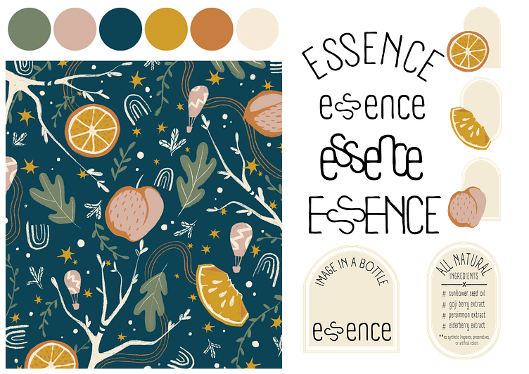
After testing more complex shapes, I chose a simple arch with an outline for the labeling, so as to not overwhelm an already stimulating backdrop.
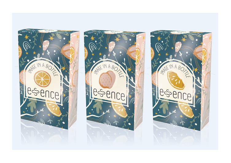
Below: the color palette, background pattern and labeling for Essence
I experimented with various arrangements of the logo, maintaining a very simple font and overall straightforward layout of the lettering. Given the already busy nature of the packaging, the simple logo counteracts the congestion and gives the eye room to breathe.
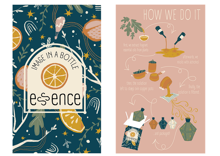
When developing the look for the front and back of the boxes, I considered where I wanted the label to appear and where I wanted to place the diagram. I chose to place the branding largely on the center front panel, and to blow the diagram up across the back panel.
As I illustrated the diagram, I continued to use only the colors in the established palette for cohesion. I kept the text minimal, as I wanted the visual elements to carry the majority of meaning, and depicted the steps with the same illustrative style I used in the rest of the packaging. I chose curly arrows and a Z patterned layout to evoke the whimsical, carefree nature of the product, and used the packaging itself as the final product in the diagram.
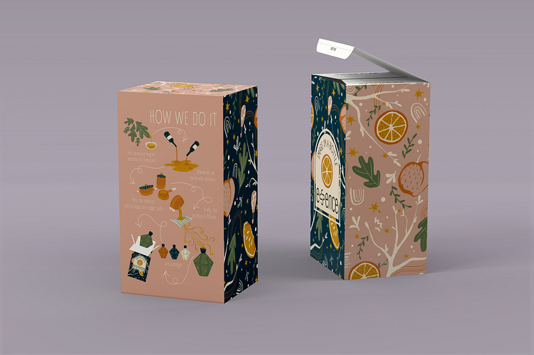
Below: The front and back paneling of Essence
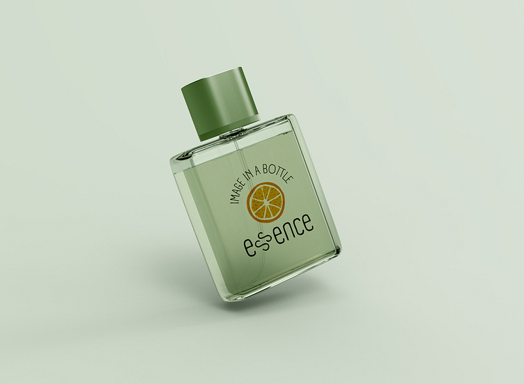
Below: The product layout of Essence (left), more experimentation with various labeling methods (right)

I ultimately really enjoyed developing the unique packaging for this product, as a lot of my other artistic projects require more finite detail and realistic stylization. I appreciated learning about perfume as I created the diagram for the back panel and loved experimenting with different ways to bring the process to life visually. If I did this project again, I would be interested to see how scaling it to a more mature audience would affect the look and feel of the product.