Complete

This Project is for company Complete for building maintenance.
These are 3 directions for client because he wasn't sure what he wanted and fore each direction I have done home page and product page.
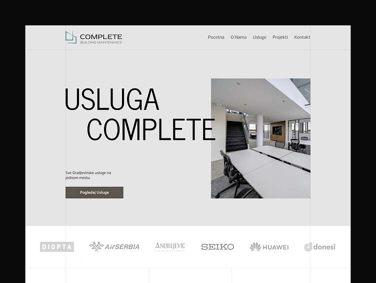
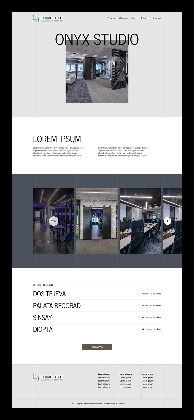
1. Corporative Direction
For the corporate look and feel, I've utilized lighter tones, a narrow and tall sans-serif font, and incorporated lines as a design element, subtly hinting at the construction industry. These lines convey a sense of precision.
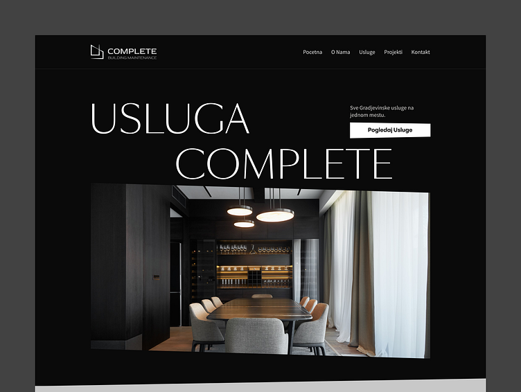
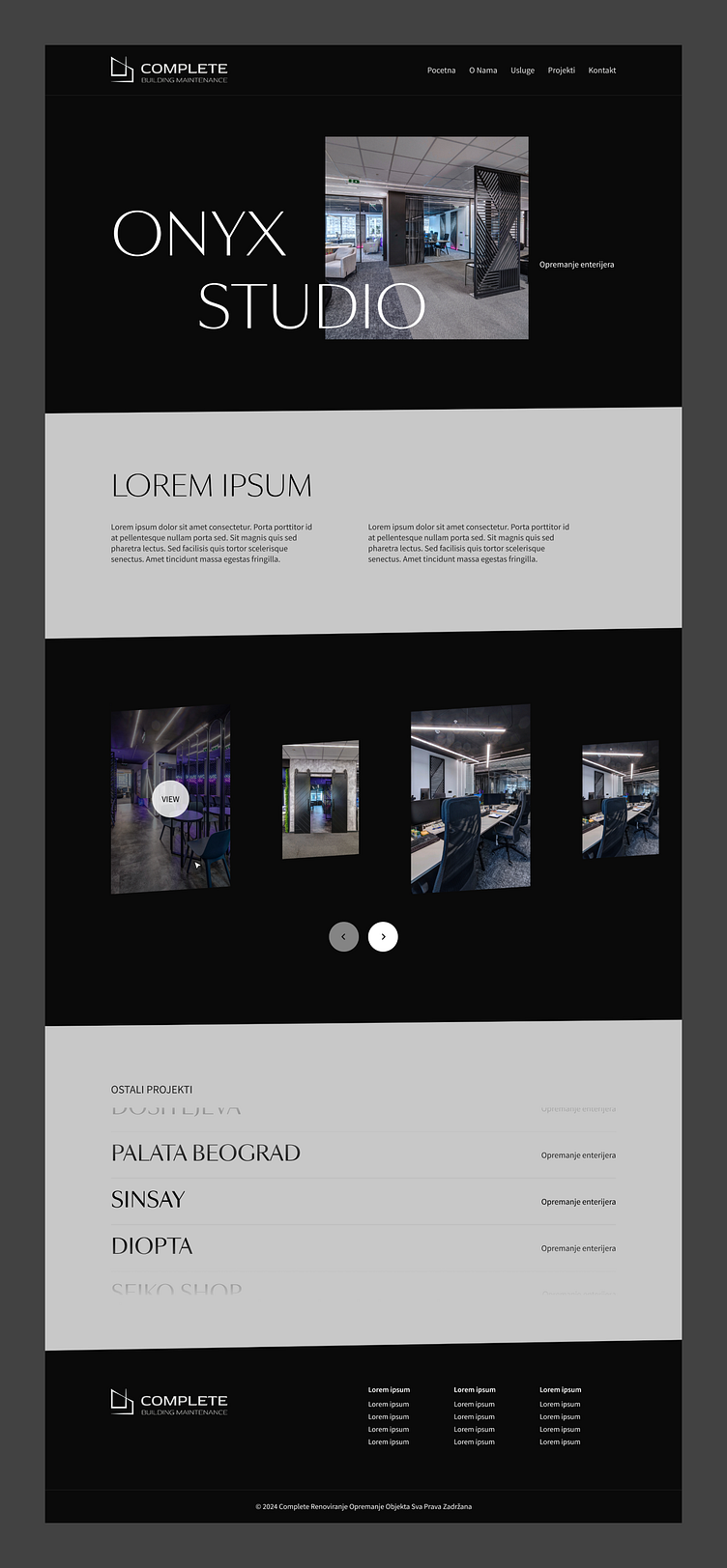
2. Corporative + Luxury Direction
For the corporate look and feel, I opted for a combination of dark and light colors, a thinner and more elegant sans-serif font, and selected an image for the hero section that adds a touch of luxury. As a detail, I incorporated slants on sections, images, and buttons, drawing inspiration from their logo, which features a slanted design, thus aligning the website more closely with the brand.
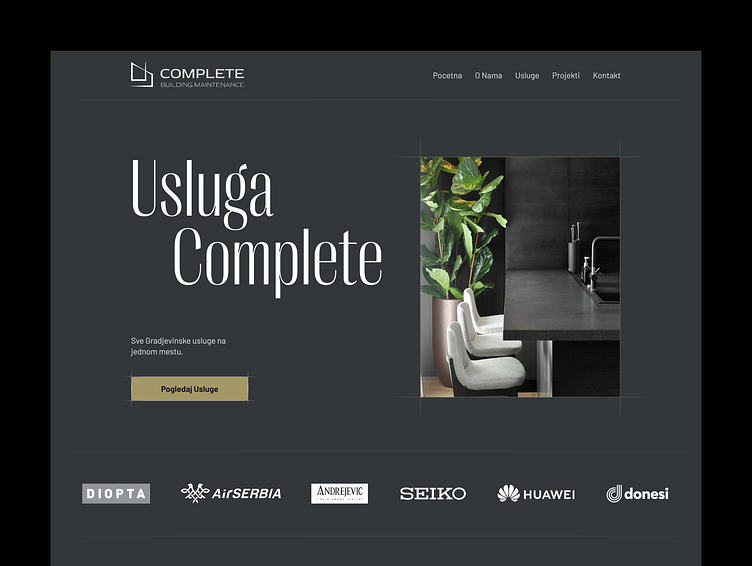
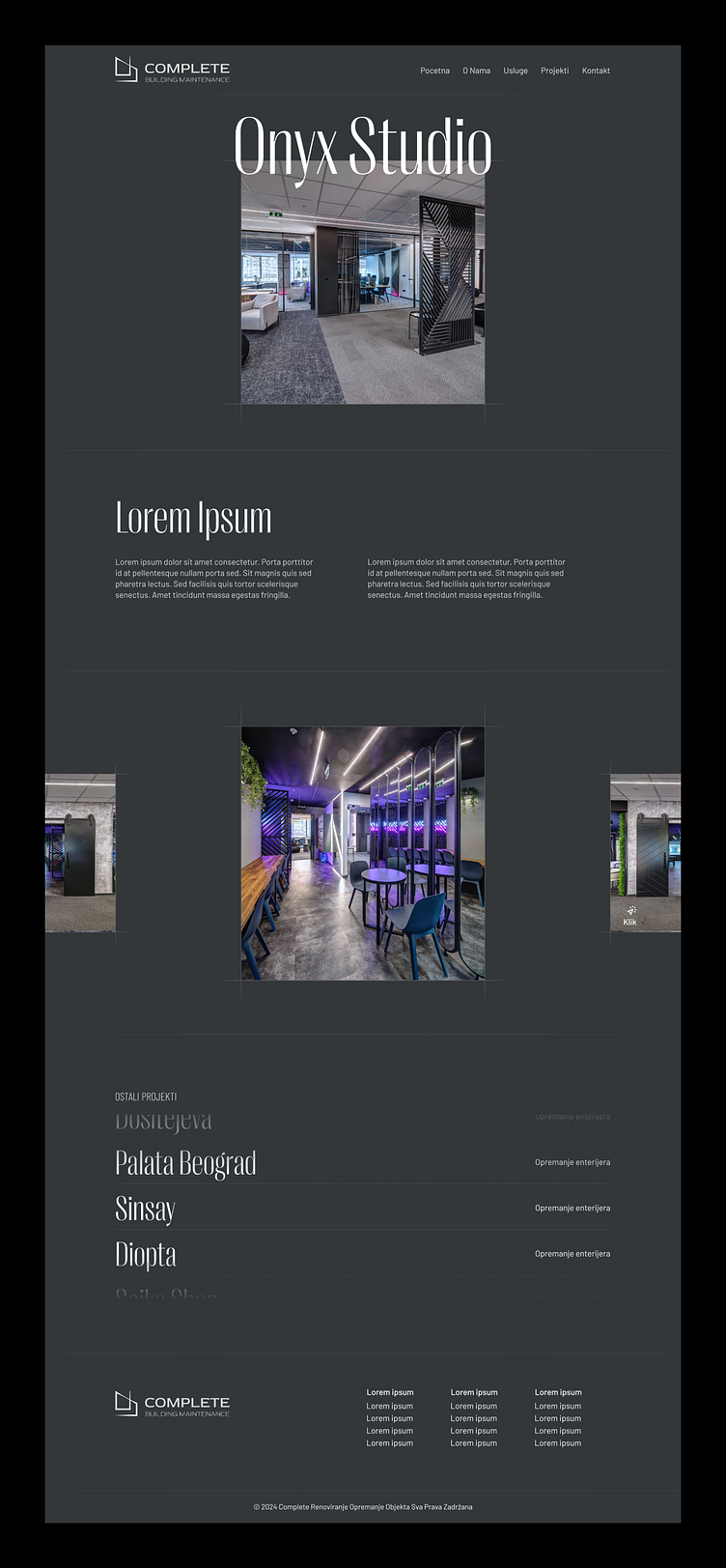
3. Luxury Direction
For the Luxury Look and Feel, I opted for a grey color palette, evoking associations with construction. I used a tall and narrow serif font, and as a detail, I added lines to the edges of images, giving them a sketched appearance.