Mobile Website Dashboard Design

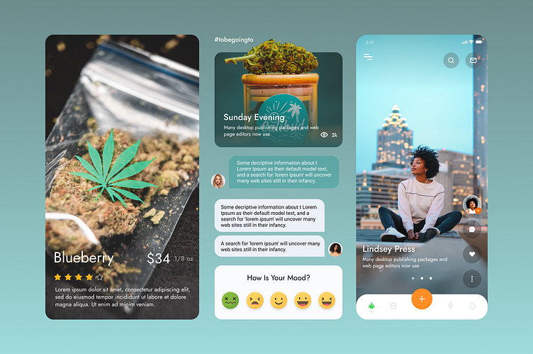
Crafting Intuitive Experiences: A Peek into UI/UX Dashboard Design
🎨 Here's a sneak peek into process and the principles that guide me: 🚀
1️⃣ Purposeful Simplicity: Less is more.
2️⃣ Harmonious Palettes: The color palettes are more than just visually pleasing; they're carefully curated to create harmony and balance.
3️⃣ User-Centric Design: At the heart of the process lies empathy for the end-user.
4️⃣ Fluid Interactivity: From drag-and-drop functionality to seamless filtering options, every interaction is meticulously crafted for efficiency.
5️⃣ Visual Consistency: From color schemes to typography, I maintain a harmonious visual language throughout the dashboard, enhancing usability and brand identity.
6️⃣ Accessibility at the Core: The design is accessible to all, prioritizing readability, color contrast, and keyboard navigation to ensure that every user can engage with the dashboard effortlessly.
7️⃣ Continuous Iteration: The design journey doesn't end at launch. I embrace feedback, analyze user behavior, and iterate relentlessly to refine the user experience and stay ahead of evolving needs.
Visit my Dribbble profile, Website, Behance and Linkedin.