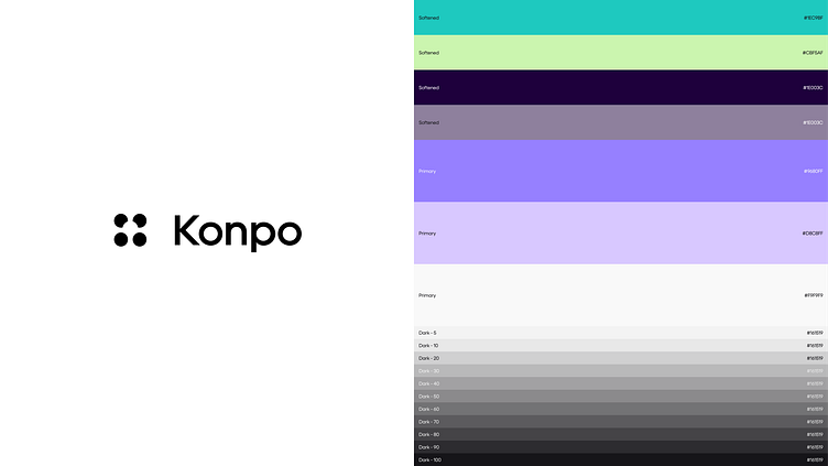
Konpo | Color Palette, Font & Icons

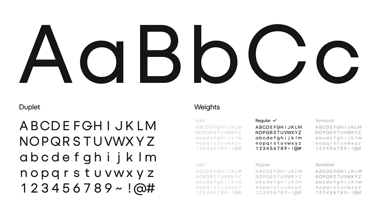
Here's a little more on the rebranding. Take a sneak peek at the wordmark, color palette, font, and icon structure.
We've crafted the wordmark in a geometric style, utilizing the dots in the symbol to create negative spaces within the letters "o" and "p". This not only enhances visual appeal but also applies the Gestalt Principle of repetition, ensuring consistency between the wordmark and symbol.
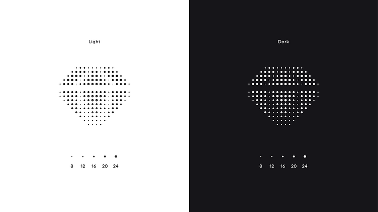
Icons are built with dots, this element is not only present in them but also in the banners, animations, and serves as a foundational pillar in our identity. Also we just found them fun to work with 🙃