08/32 – San Diego Wildcats

Goin' Wild
We wrap up the Pacific Division this week with the eighth team of the project – the San Diego Wildcats.
San Diego is one of the younger up-and-coming franchises. They've played spoiler the past couple seasons hovering around the playoff fringe after three straight Wild Card appearances from S22-24. With a stout run game, a beefed up defensive front, and a relatively young roster, it wouldn't be surprising to see this team shake things up in the future.
Visual Direction
This fictional franchise may have been created in the mid 2000s, but this team embodies the 90s. The "Wildcats" team name is a nod to San Diego being one of the cultural epicenters of extreme sports – being the headquarters of many pillars of the industry and having a sprawling abundance of surf spots, skate parks, and BMX tracks. Additionally, the name can be linked to the San Diego Zoo – the most visited zoo in the U.S., housing over 4,000 animals in 600+ exhibits.
The 90s-inspired design doesn't stop at the name. With a dual blue color palette, eccentric typography, and cat stripes that look like waves, the Wildcats execute a double-backflip dive in to a truly unique look.
Execution
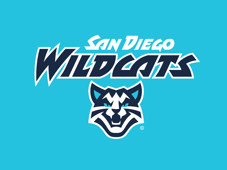
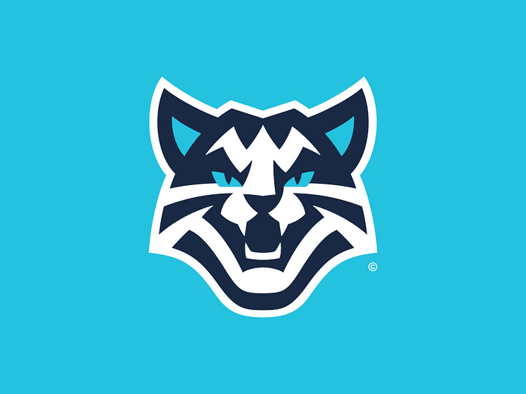
In the primary logo spot is a snarling wildcat with white and navy stripes and ocean blue-colored eyes. A hidden "W" for "Wildcats" is formed by the stripes in the cat's forehead.
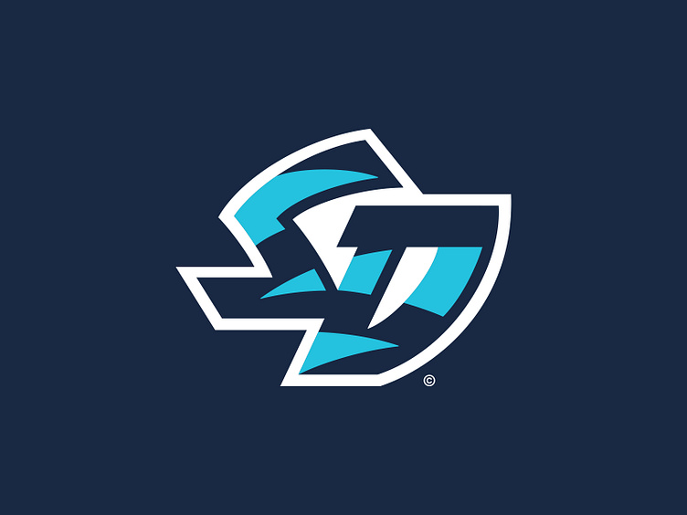
An "SD" monogram takes the secondary logo spot. This mark incorporates the wildcat stripes (or ocean waves) that are also seen on the team's uniform sleeves.
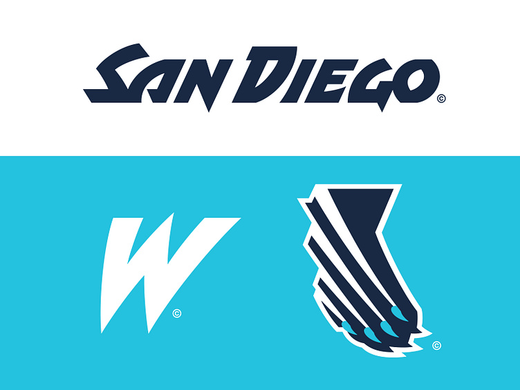
The Wildcats also have a tertiary logo that depicts a wildcat's right paw swiping across and forming a silhouette of California. The tear marks created by the claws can also be interpreted as the wake left from a boat or a surfboard.
The team typography takes inspiration from the angsty, dry ink brush-style often used to express counterculture and individuality but is executed to be sharper and less organic. The linework flows from one letterform to the next and incorporates points and curves that mimic the Wildcat stripes used throughout the identity. From the "Wildcats" wordmark is a "W" used in a partial logo capacity.
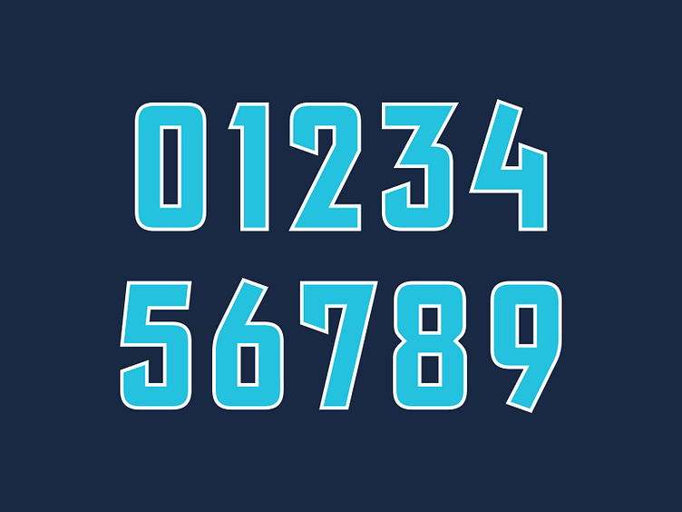
For the number set however, San Diego reels it back in ever so slightly. The dimensions are adjusted to better suit its function but some of the sharp points and curves are still incorporated to make this feel distinctly "Wildcats".
Earning the Stripes
With a wild new graphic suite, the San Diego Wildcats now have a rejuvenated brand identity that plays on the one-of-a-kind culture of SoCal that's representative of the young-gun team that this team has quickly became.
Football Helmet Mockup by SportsTemplates
____________________