SAPOCHE CLUB | LOGO DESIGN & BRAND IDENTITY

Sapoche Club [Logo and Branding Project]
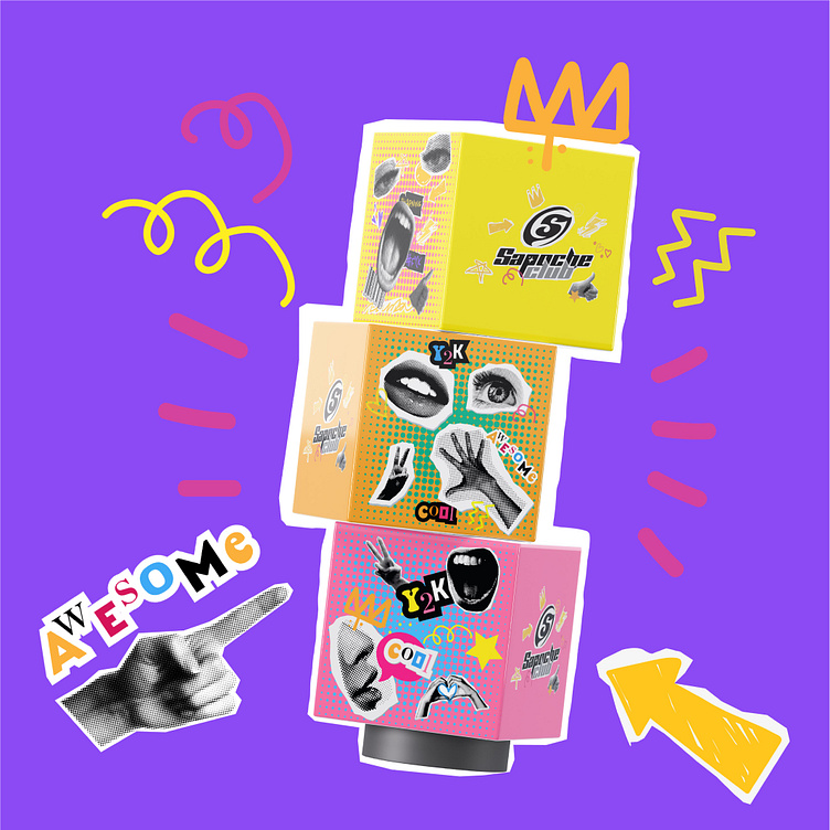
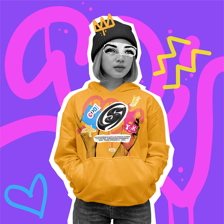
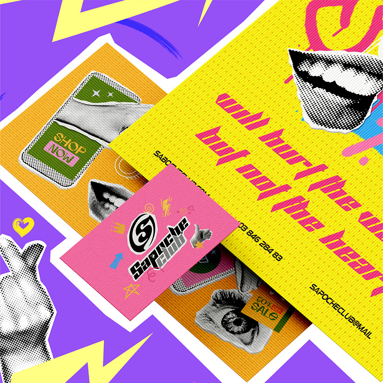
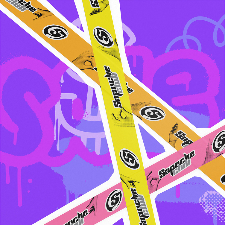
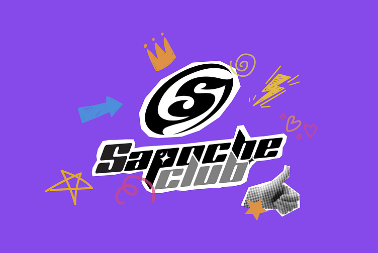
The Sapoche Club logo was designed by Kaiza with Y2K style, inspired by the mix and combination of retro and futuristic elements for both men and women with extremely personal black and gray colors. The stylized logo with the initial letter "S" is an iconic representative symbol of the unique breakthrough of the Y2K fashion style. The font uses creative, attractive rounded corners, clearly expressing the brand's spirit.
Small details like the 4-pointed stars in the logo are used as highlights to create vividness and appeal. Combining all these makes customers feel stimulated with creativity and full of energy along with the fashion style of the decade.
Designed by Kaiza
Copyright © Kaiza. All Right Reserved
Contact us:
KAIZA CO.,LTD
• P: 0889 996 399
• E: info@kaiza.vn
• W: www.kaiza.vn