B TEN - Brand Identity Design

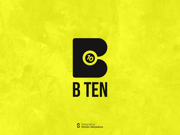
B TEN - Logo Concept

This logo I made combines a letter "B" with a snooker ball to show it's for a snooker club. The "B" is designed maintaining negative space. Inside the letter, there's a snooker ball with the number 10 on it, showing it's a snooker place. The design makes it look like the ball is moving inside the letter "B," giving it a lively feel. It's a clever way to show what the club is about and makes the logo interesting to look at.
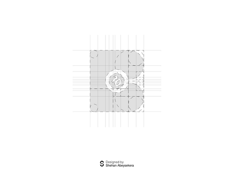
Use of Golden Ratio
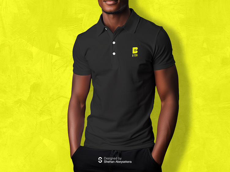
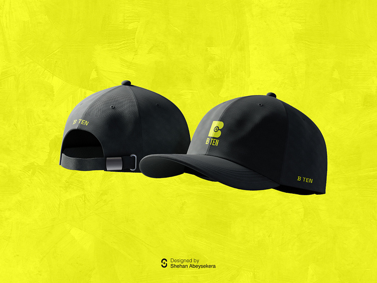
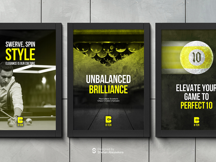
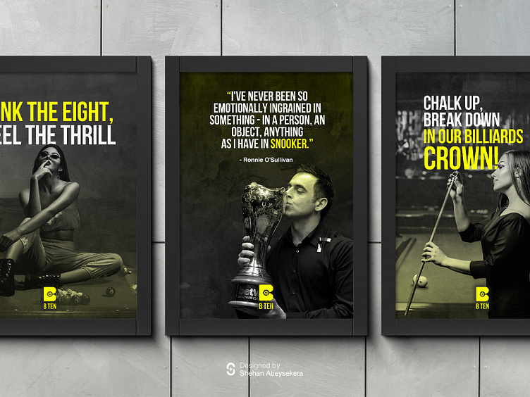
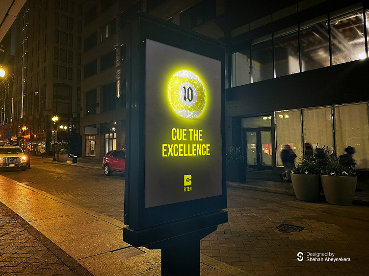
Brand Application Designs