Meteorological Service Website Redesign

Hello everyone,
#UIX101 I have completed task number #037
In this task, I worked on an alternative design for the #Meteorology province/district weather forecast page.
I usually use the default app on my phone to check the #weather. Therefore, I can say that this is the first time I have examined the #mgm website. When I examined the site, I saw a few things that didn't make sense to me.
When the language of the site is changed, the entire website changes. My logic tells me that the images in all languages should be the same. But if there is a different situation, you can share it with me.
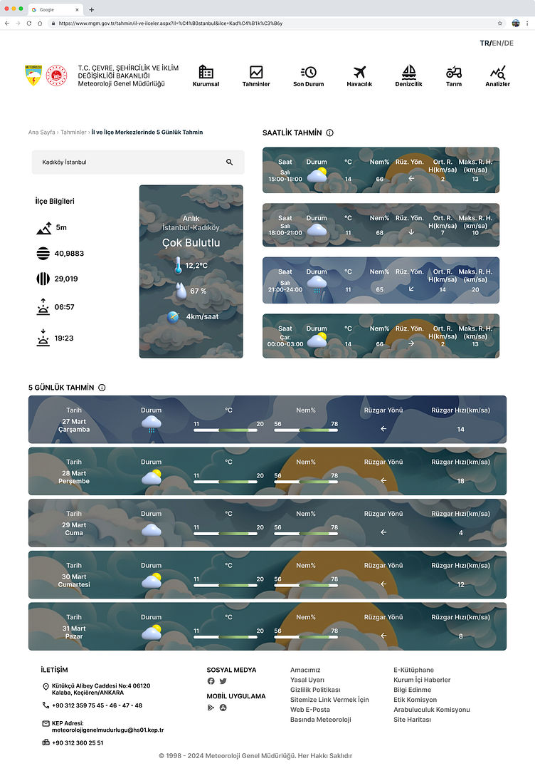
The institution's name and logo appear in different combinations with different language selections. At this point, my logic says that these should also be uniform. When writing the name of the institution, it appears as "Turkish State" in the English translation, while in the German translation it appears as "Türkischen Republik". If there is something I don't know, please enlighten me on this subject as well.
When I examined the air temperature data (I didn't look at all of it, of course, but I can speak for 4-5 different locations), the perceived and measured temperature values are the same. Again, my logic says that wind speed and humidity affect the perceived temperature. In this case, the values I looked at are equal, which is a low probability.
Anyway, I'm not the one collecting the data, so now I'm moving on to the design side. The existing tab bar on the website looked too cluttered. It contained elements that were unrelated to each other. First, I sorted them out a bit.
The data is presented in table form. While designing, I generally used cards. I designed the background visuals on the cards to change according to the weather data. I also focused on using icons as much as possible instead of text. When choosing the icons I used on the page, I used 3D icons in the sections where I wanted to highlight the data.
In the old design, there were footnotes listed in bullet points at the bottom of the page. Since they were located in a place independent of the relevant section, I decided that they were not very efficient for the user. Instead, I revised the design so that the footnotes can be accessed from the info icon next to the title of the section they are related to.
I tried to create a user-friendly design. I hope you like it ☁️
#UI #UX #tasarım #kullanıcıarayüzü #userexperience #userinterface #design #redesign #KullanıcıDeneyimi #websitedesign #meteoroloji #hava #havadurumu #mgm #meteorolojigenelmüdürlüğü #dailyuichallenge
#portfolio #dailyui #ui037
Before
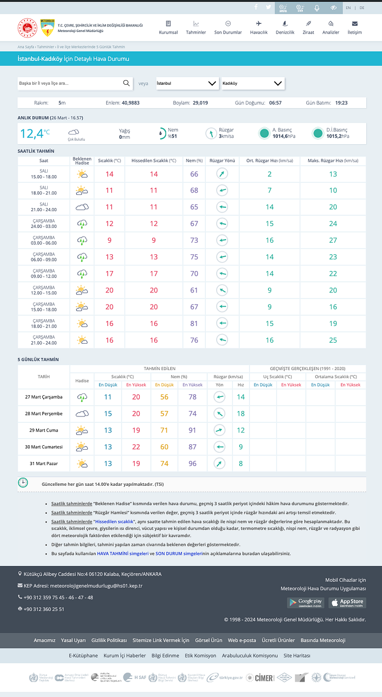
After