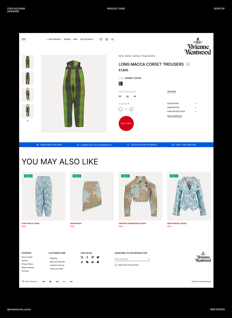
Product page / Design Concept / Vivienne Westwood

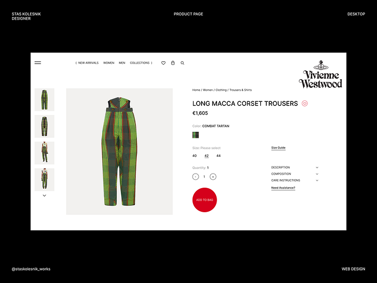
Sneak Peek #3 / Vivienne Westwood
Hey everyone 👋
This time I have prepared a product page design for you 🤓
The only interesting thing here to me is the button — its shape and general appearance (it looks incredibly strange, doesn't it? 😏)
But this allows me to focus the user's attention on it and make a certain call to action😎🤞
Everything else is standard:
—“bread crumbs”,
— Accordion with some extra info
— Extra links to more help user (“Size guide”, “Need Assistance?”
*it looks like the logo is encroaching on the content itself, but I decided to leave it that way, because thanks to this tension in the space, the user will immediately look at this area (product title, save button and logo itself)
**Below is a full page version 👇
Let me know your thoughts 💭
Have a great day 🙌✨