#10 - Ruul Navbar Redesign

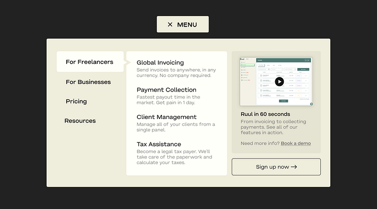
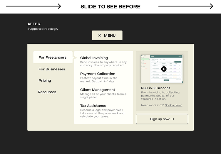
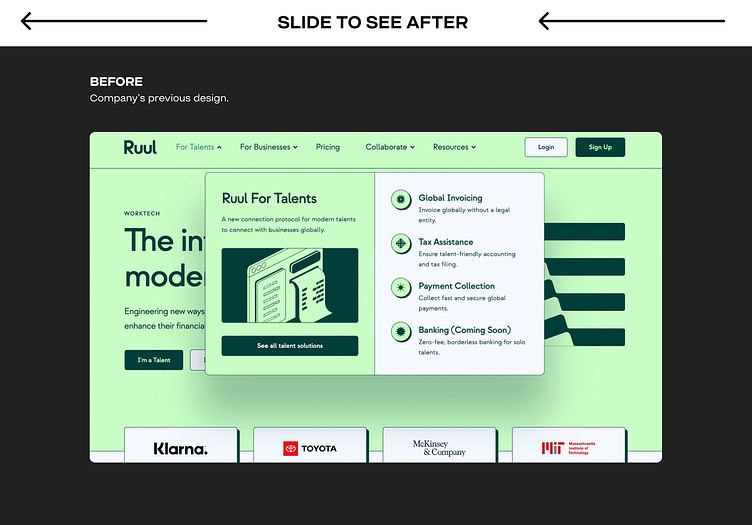
Design: Concept design for Ruul's navbar.
Goal: Make it more functional and less eye-burning.
What did I do to improve it?
Removed the purely aesthetic images and icons.
Used the screen real estate for a quick demo video and a sign up button to reduce confusion and increase conversions.
Combined all the pages in a single menu to reduce clutter.
Simplified the content by using common English.
Updated the color palette with a more subtle one to make the whole thing easier on the eyes.
It's not really possible to measure ''how much better'' a design is without testing but the approach I took on this one seemed to be worth exploring. ✌️
✉️ Contact me via email pinarhaskiris1900@gmail.com