Can't decide. Facit, Ratio or Tisa?


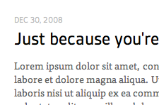
Can't decide which typeface to use on headings.
I really like Facit. It's so clean, looks a lot like FF Din (which I love). But it's very very different from the text typeface (Tisa).
Ratio has a bit more character (no pun intended) than Facit, I really like the more humanist lowercase 'g'. But I wish it had some titling figures to use along uppercase characters.
I love Tisa for text. I also like it for headings. But I feel like having a sans-serif for headings.
What do you think?