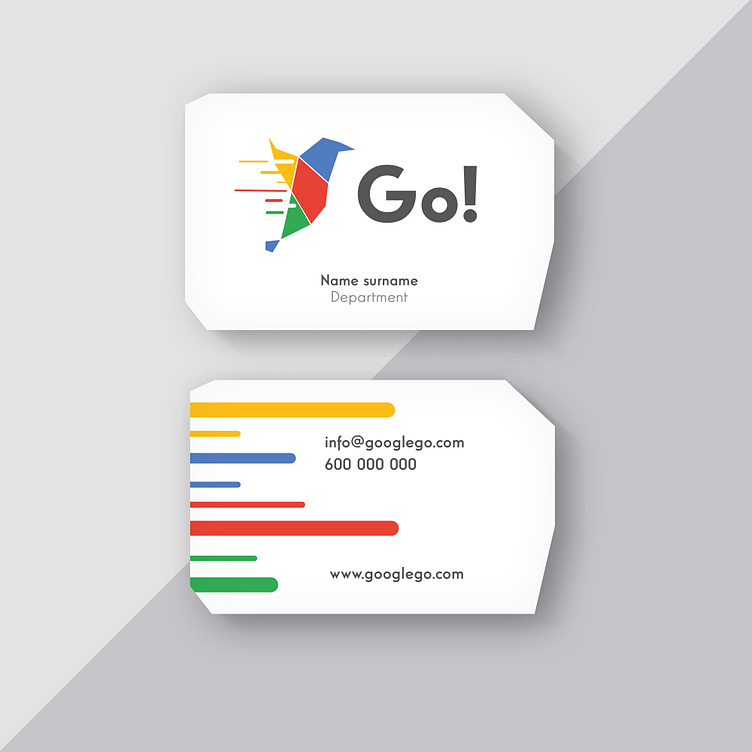
Go!

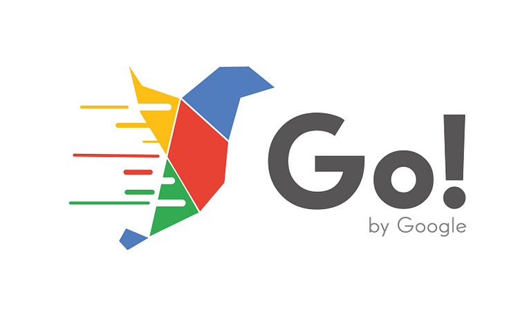
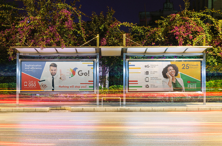
Personal branding project, developing the brand proposal for a new Google service. This time it is the new virtual mobile operator Go!, standing out from its competitors for the speed of its connections and the sophistication of the service offered.
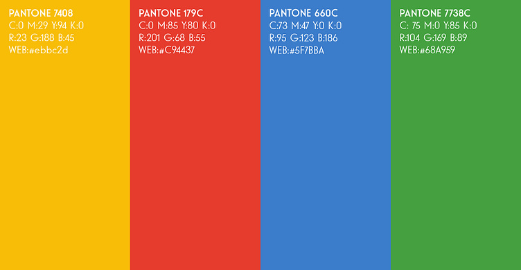
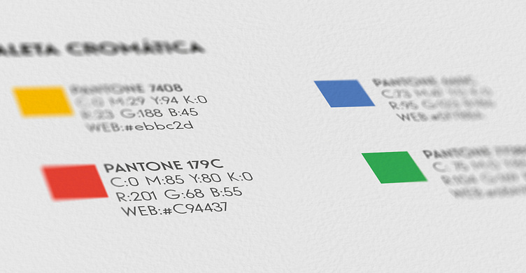
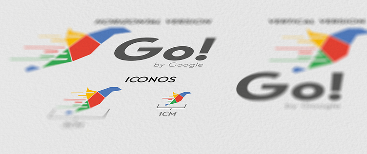
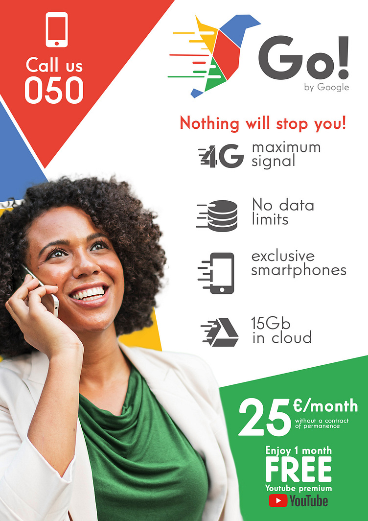
The typography and colours used in other Google products have been retained for their distinctive character in the market. The chosen anagram reflects very well the essence of the service offered (Sophistication, speed and innovation).
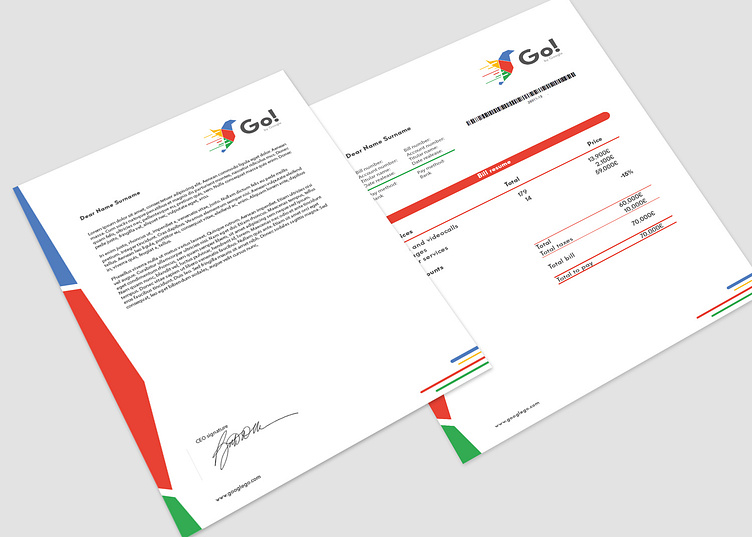
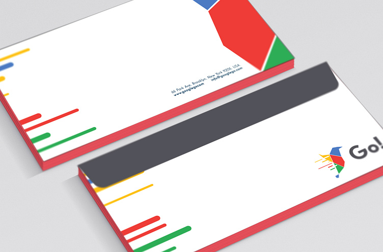
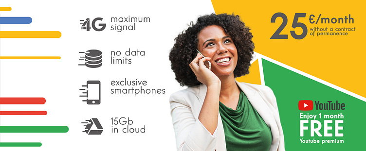
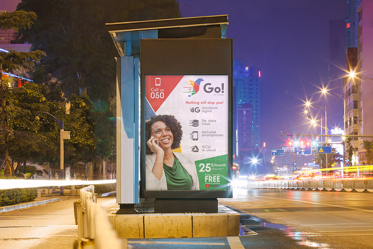
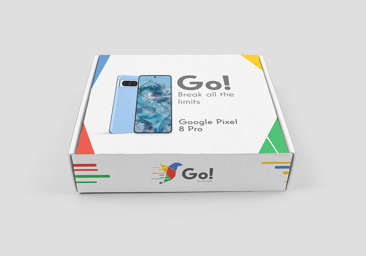
From this point, the different graphic supports are created, such as corporate stationery and different advertising contact points, maintaining a tone of communication aimed at young, enterprising people, of medium/high economic level who put the quality of the service before the price.