social recruiting mobile app ux + design system

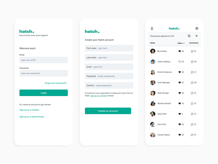
hello here is another snapshot from the social recruiting app venture three years ago.
i was thinking about this and the main thing i would do differently is i think in the logo i wouldn't have done a literal chick hatching. i think it's hitting the nail a little too over the head with that one.
i do like the idea of using an icon as a period so i wonder what i would do differently. a heart? but that would seem like it's a dating app. a smiley face? is that weird? it's hard to know what type of icon symbolizes friendship and growing an organization. maybe like... a notification bubble? or mailbox? ..... not sure...
it's easy to think you would do stuff way better if given a chance to redo a project now but it can be hard to see exactly what you would do to improve it. i think that's how you know you did a good job on a project. i definitely did my very best to develop this product - from the actual features and functionalities to the user experience and the visual design system and design language.
there's a lot of color and it's very "happy" for me - now i think i would have been more minimalist and edgy about it, but i think the optimism and innocence and wholeheartedness here is kind of adorable.
i am still really proud of the product itself. we developed the whole thing and had a hundred or so users and everything but just all of us were product heads and none of us liked sales. still if anyone believes they want to be a revenue leader in exchange for a 1/6 stake in everything, totally for sure hit me up
website emilyreadey.art