01/32 – New York Lightning

Leading the Charge
We're kicking off week 2 of #TheUFLProject with the reigning champs – the New York Lightning.
In 27 seasons, the Lightning have been to 4 championships and claimed victory in each – including two of the last three seasons. They're a perennial contender and have made their mark through consistent QB play and a cohesive defensive unit. They play in the Metropolitan Division of the East Conference.
Visual Direction
The name “Lightning” is a reference to the famous inventor Nikola Tesla, who spent significant time in New York in the late 1800s/early 1900s experimenting with wireless electricity. More specifically, the curious Wardenclyffe Tower and its design to shoot bolts of electricity in to the night is the key visual here.
The visual of early 1900s “Gatsby-era” New York was a powerful force in the identity for the Lightning. It encapsulates the glitz-and-glam, the hub of large corporations and pop culture, and developments in technology that feel commonplace in today’s age but one hundred years ago was only brought to life through bizarre experiments.
Execution
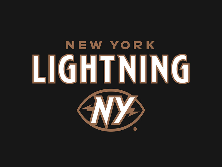
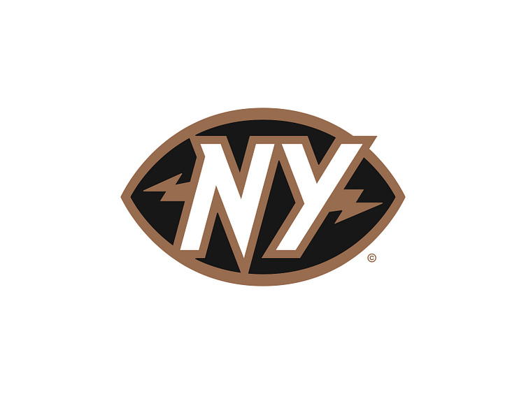
The new primary mark features a redesigned "NY" lockup, a prominent visual throughout the team’s history that we built the new identity around. It’s flanked by a lightning bolt on either side and is nested within a football silhouette.
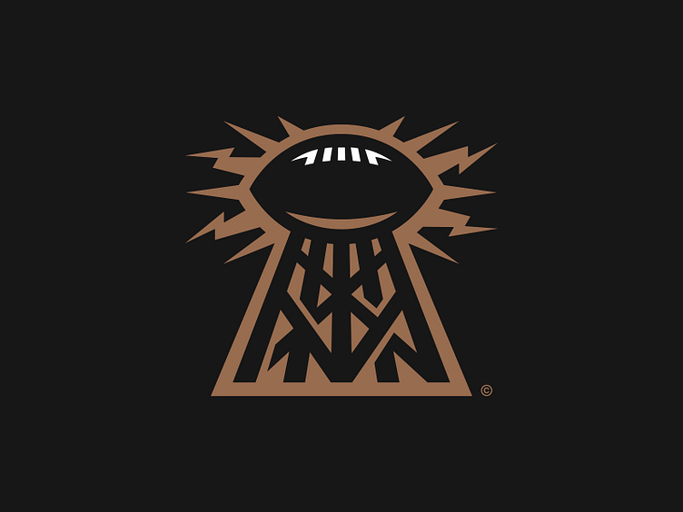
The secondary logo resurrects the Wardenclyffe Tower, this time with a football as the main conductor. It’s structural beams form an “NY” at its base.
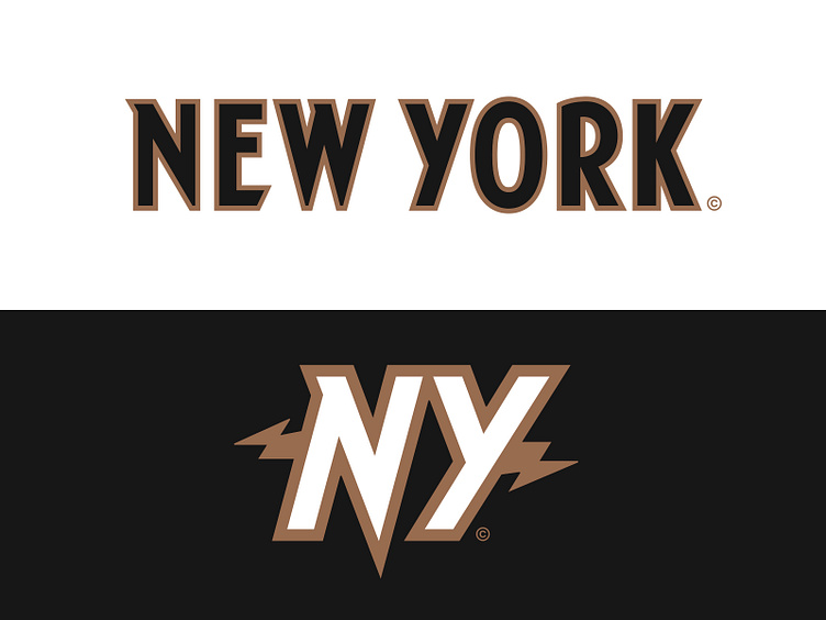
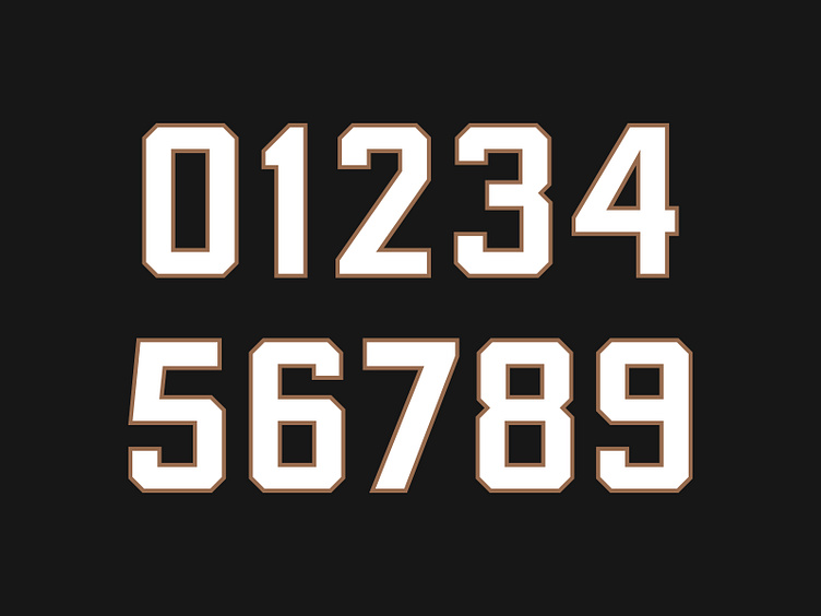
Logically, the typography is inspired by 20th century graphic design with hints of art deco in the raised belt lines and geometric nature. The angled serif components in the “G” and “N” mimic the lightning bolt from the primary. This style is also translated through a custom font for the nameplate.
The jersey number set takes the traditional athletic block and throws it in a time machine. It features quirks that urge you to nudge some anchor points but enough charm to put the swords down. The higher belt lines mimic the art deco nature of the team’s typography.
Providing the Spark
The New York Lightning’s refreshed brand identity acknowledges the team’s visual history and anchors the franchise geographically through unique moments in time – presented in a tightly packed graphic suite that began as crayon on paper and exists today (virtually) as a team suiting up to take field and lead the charge.
Football Helmet Mockup by SportsTemplates
____________________