Workfolk - A Vintage Utility Font

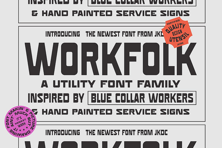
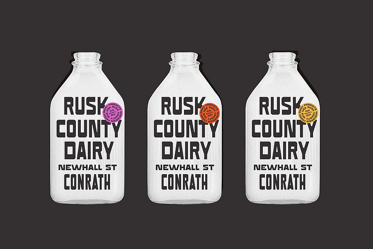
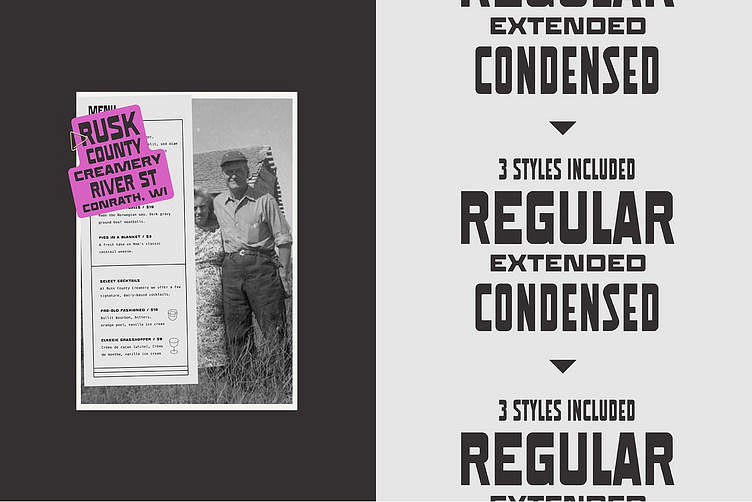


We call Workfolk a utility font because that's what it's designed to be... Nothing fancy, maybe even a little wonky at times... But it does the job.
The letterforms look like something our granddad may have hand painted on a plank of wood to advertise his latest corn harvest on the side of the road.
Take the "D" for example, it seems to be just a bit too wide... But that's ok, because that's how grandad did it.