


Real estate logo

Partially used proposal I designed while working at HZDG for a new 3-building luxury apartment complex in Pittsburgh, PA, USA — a very gritty, industrial town.
The architecture and interior design of the buildings is modern with a youthful, urban, and heavy industrial feel. Lots of mixed materials, including steel, wood, glass, and concrete. The design cues are similar to that of an upscale nightclub.
Since Pittsburgh is home to a very vibrant graffiti art culture, several graffiti artists were commissioned to create murals and other artwork for the interiors.
The target audience for this development are young professionals working mostly in local medical and scientific fields.
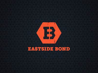
The name of the development, which we named, is a play on the word 'bond,' which conveys aspects of bonding steel, as well as chemical bonds.
Thus, this logo was intended to reflect both meanings. The hex shape references both a bolt as well as chemical diagrams. It also features an E, a B, and also a 3 (since there are 3 buildings in the project).
This logo was part of a total branding proposal that I was art directing; another art director proposed a different logo and branding direction.
The client ultimately liked my logo, but preferred the other branding direction, so the result is a bit of a mashup of the two, which can be seen here: