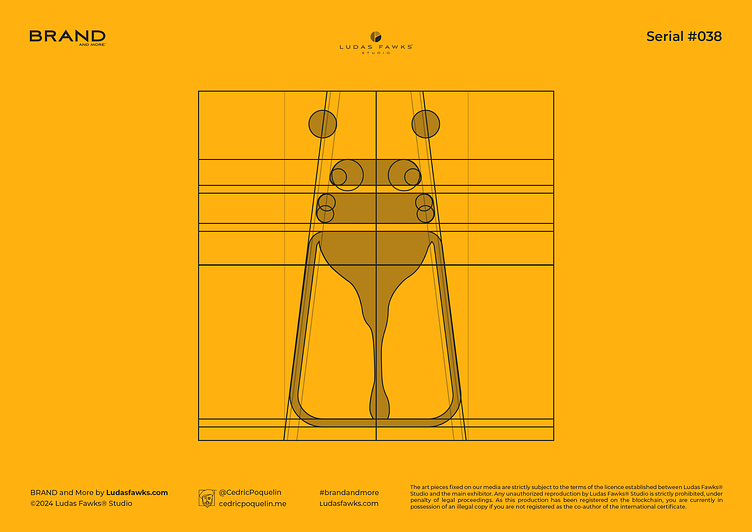
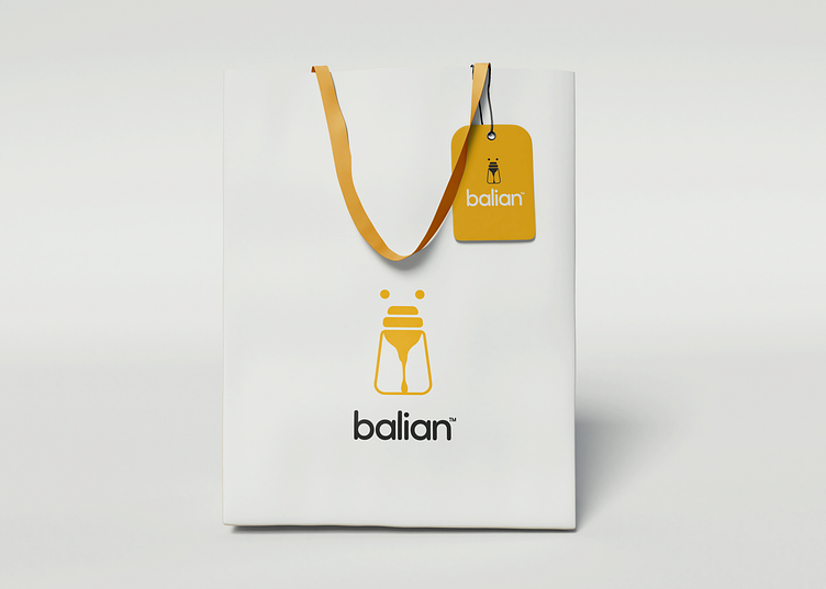
Logo | Balian™

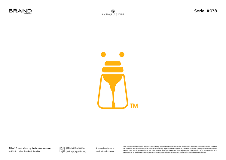

Logo Balian™ | Rare Honey
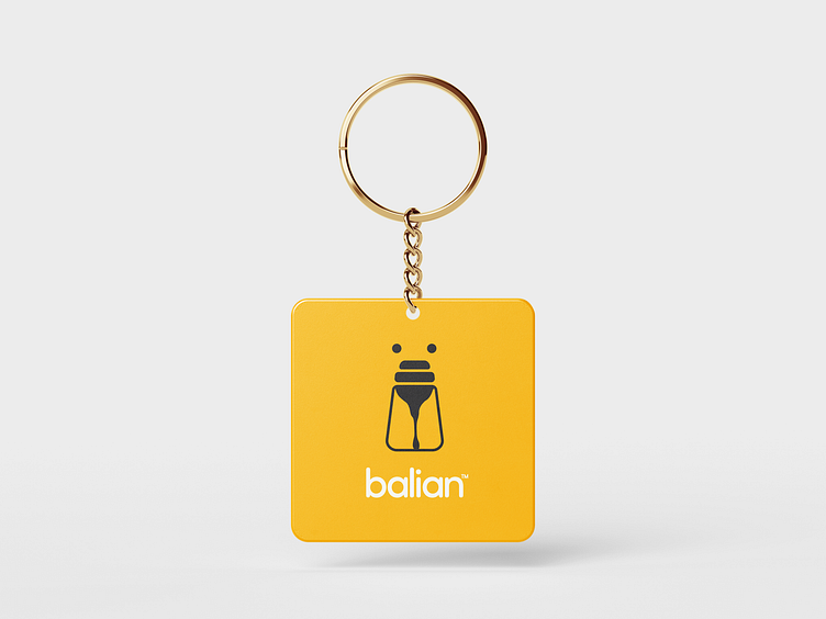
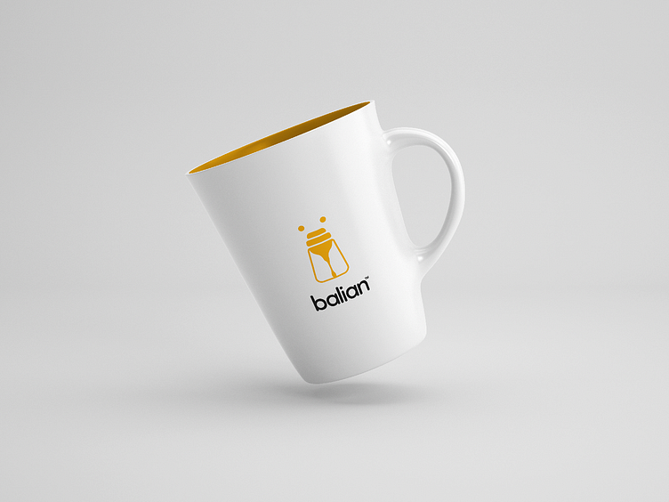
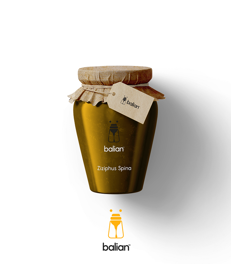
Balian™ is a French brand that markets original and rare honeys. Initially called Soundness Honey™, the branding has evolved today to crystallize renewal and dynamism.
Originally, we wanted to go with an entirely typographic logo in order to highlight the clean and refined side of the brand. We nevertheless wanted to develop a conceptual pictogram. Although we are not in favor of illustrating customer activity in their pictograms, the concept developed for Balian™ was a bear (for user-friendliness) whose snout is illustrated by a honey spoon. The whole also suggests the shape of a bee.
These three elements being the preferred symbols of honey brands, bringing them together intelligently in a single pictogram made this concept unique.
_______________________________________
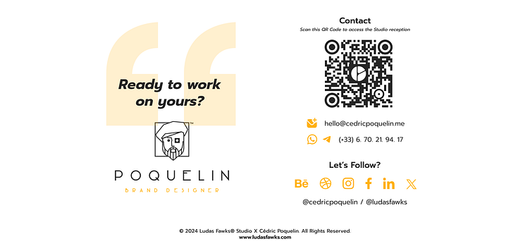
Ready to Work on yours?
and make something great with your project !
_____________
What We Do
Contact
> What'sApp | > E-mail : hello@cedricpoquelin.me
Let's Follow
> Behance | > Instagram | > Facebook > Linkedin
_____________
© 2024 Ludas Fawks® Studio X Cédric Poquelin. All Rights Reserved.