Logo Stadsbrouwerij

For the past couple of months we worked hard to complete the full branding of Stadsbrouwerij Eindhoven (City brewery Eindhoven).
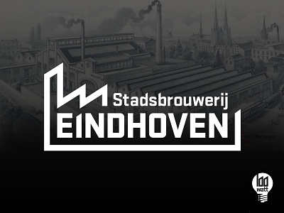
When we look at both the logos we see a few similarities, the industrial details link both to each other. With this one we present the local oriented logo, it speaks to the people of Eindhoven. Something to be proud off.
The second logo we present goes far beyond the borders of Eindhoven. It uses the characteristics of Eindhoven like the famous light bulb without using the full city name. This variation aims at a wider audience: everybody who likes delightful craft beers!
Both logo's telling the same story on different levels of abstraction.
For more information about the brewery visit:
http://stadsbrouwerijeindhoven.com/de-brouwerij
And be enlightened by the unique beer collection