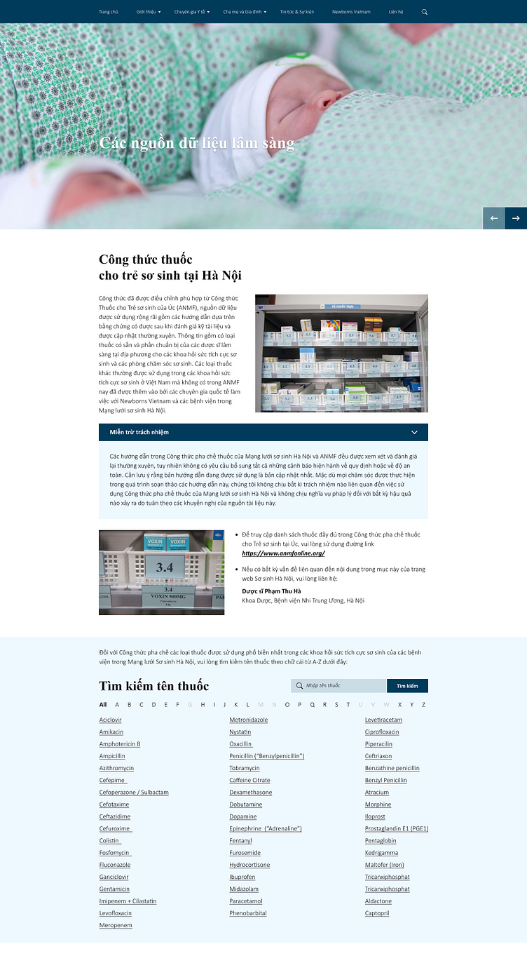
Hanoi Neonatal Network (HNN)

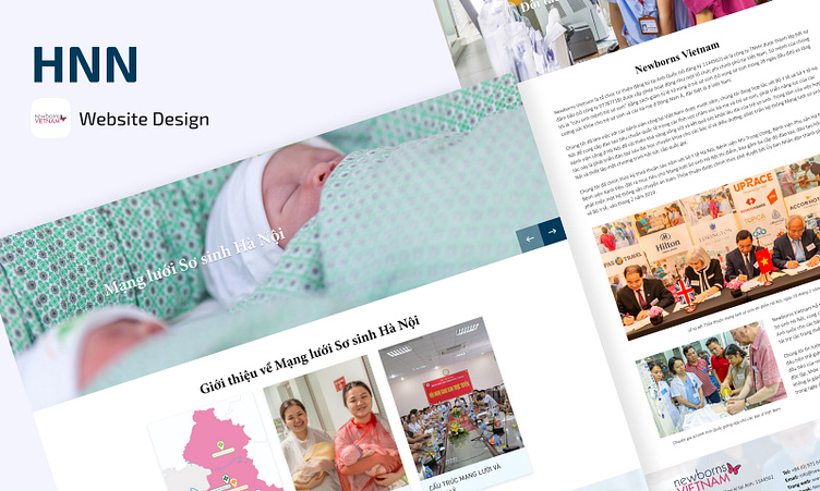
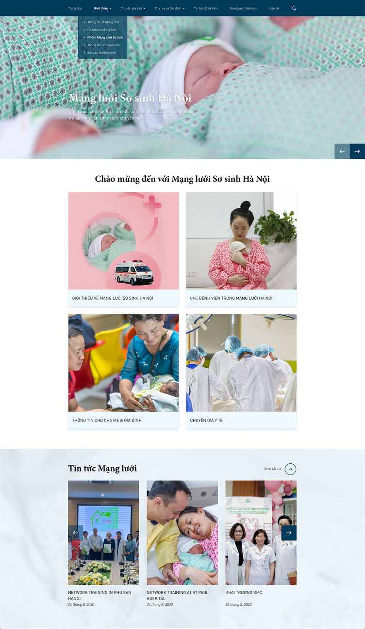
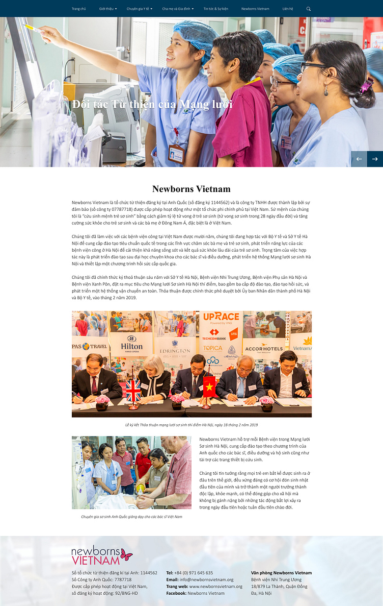
🖥️ Desktop Version
During the process of implementing the design, the color palette is chosen based on the product’s brief: gentle, reliable, feminine (represent for moms) and suitable for healthcare industry.
Finally, Prussian Blue (#003B5B) - a combination of 40% green & 60% blue is picked to create a feeling of lightness, a feeling of being cared for just like the meaning of HNN. Moreover, another lighter blue (#EEF8FF) is picked together with few of pinky images to supplement for the color palette giving the result of positive, happy and trust emotions/ feelings for all the moms, and dads when they come to this website.
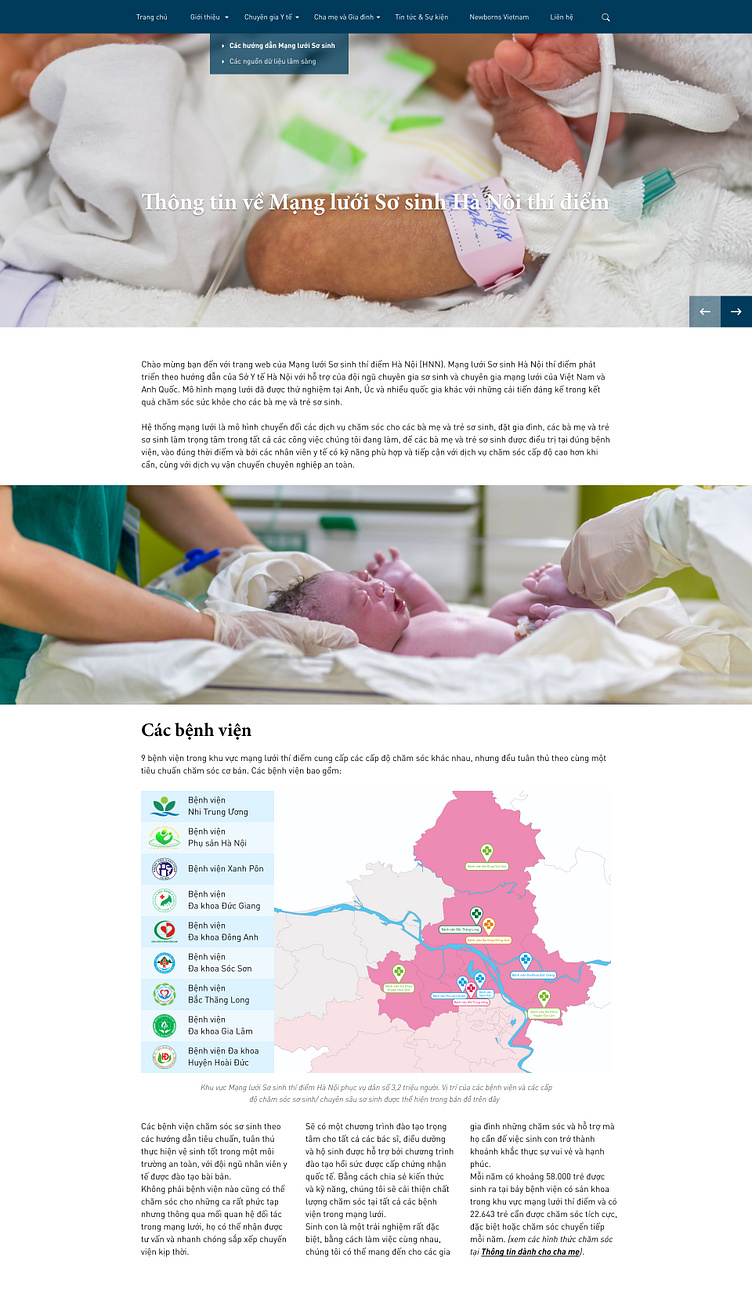
Because information is the most crucial part of the website, typographic hierarchy in this case is really important.
This is a method of ordering typefaces and fonts in a layout to create divisions that show users where to focus and how to find information
Columns are laid out and divided in columns all the text information, choose the different font sizes for the headings, titles and body.
Some links and important texts are also used in a reasonable way for users to easily identify.
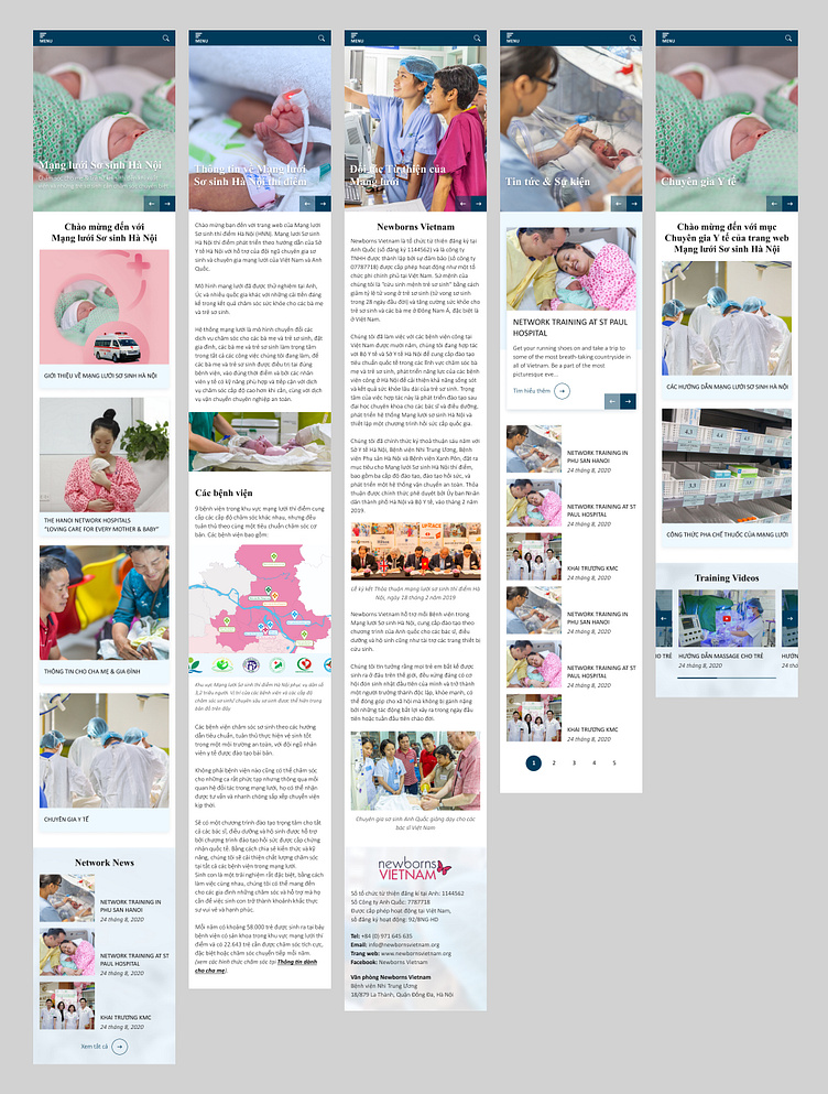
📱 Mobile Version
👉 Check out full designs & case study here: Hanoi Neonatal Network
👩💻 Here is my portfolio - looking forward to your connection: CanDy's Portfolio
Hope you like it and press "L" for appreciation 🥳