Jack Neck, Letter J and N Fitness Logo Brand Identity Design

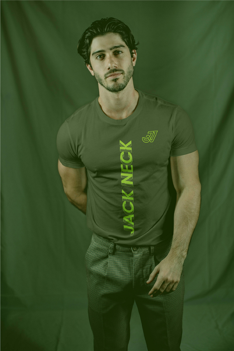
Introducing Jack Neck, where fitness meets innovation, and lifestyle intertwines seamlessly with strength. Jack Neck isn't just a brand; it's a movement, a commitment to empowering individuals on their fitness journey with a unique blend of style and performance.
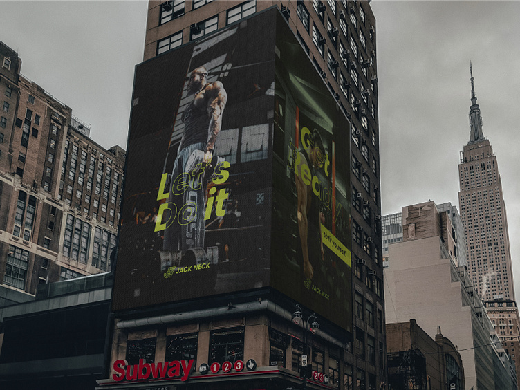
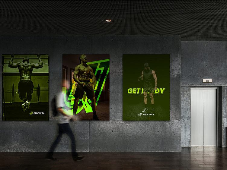
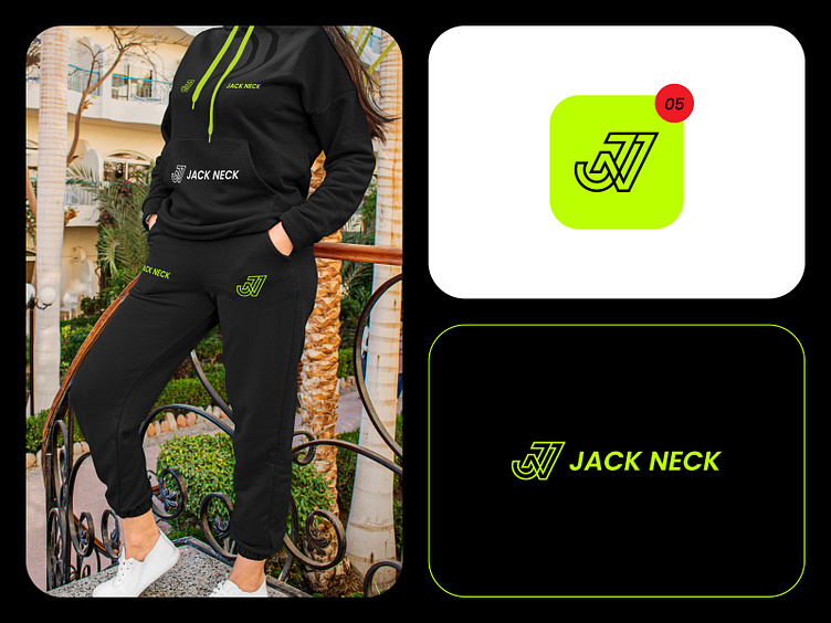
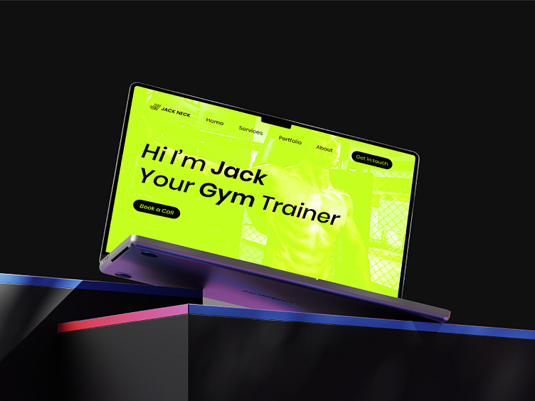
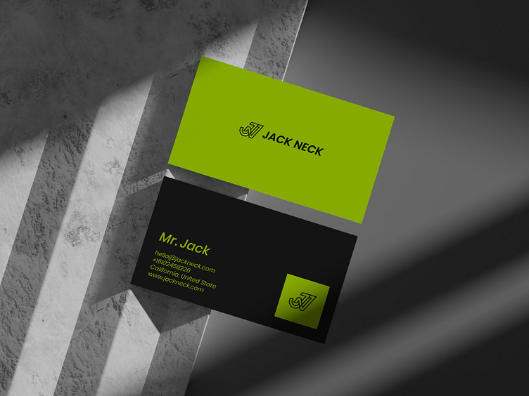
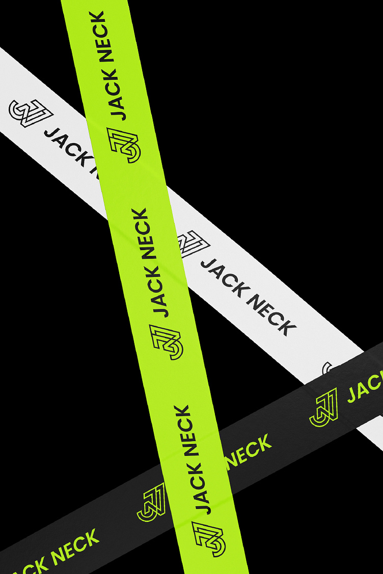
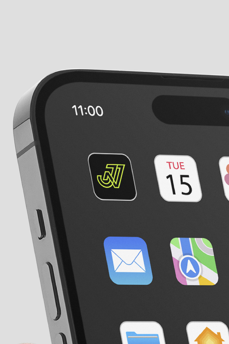
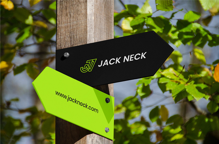
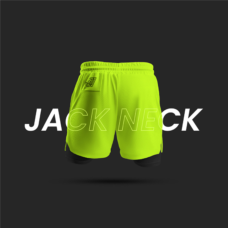
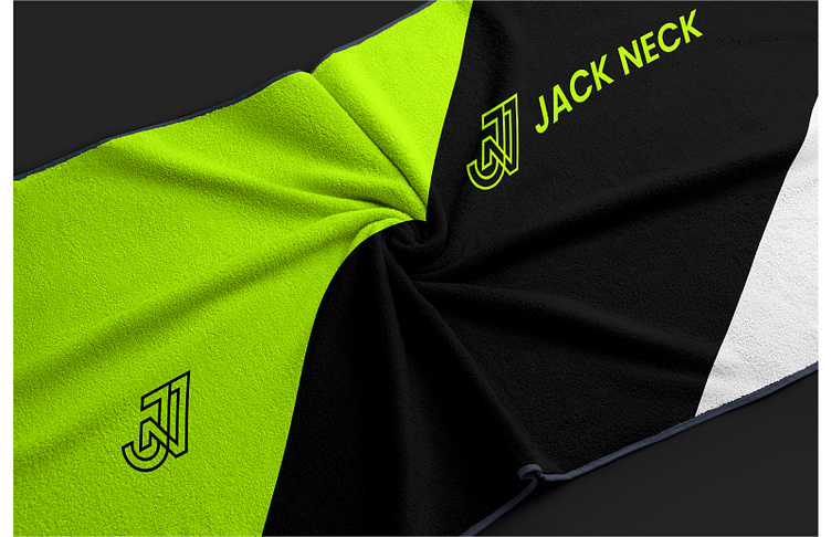
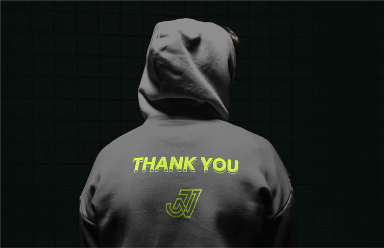
The Jack Neck logo seamlessly blends the letters 'J' and 'N' with a distinct sporty flair. This dynamic design captures the essence of our brand, fusing the elegance of these letters with a bold, athletic vibe. The sleek integration of 'J' and 'N' symbolizes our commitment to style and performance, reflecting the spirit of Jack Neck as a fitness brand that stands out in both aesthetics and functionality.
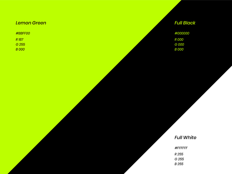
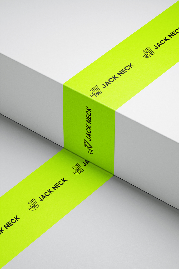
Lemon green, is a vibrant hue that embodies freshness, energy, and a zest for life. It's a color that resonates with the vitality of nature, reminiscent of sunlit meadows and citrus groves. In the world of Jack Neck, lemon green isn't just a color; it's a statement.
Visit: bento.me/rezapixels


I would appreciate your feedback on this project.
Want to buy this logo concept? Tap here🥳
For work inquires