K-State WIP
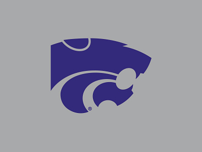
Concept only. See attachment for old vs new powercat.
When I was an athlete at K-State I never thought twice about the powercat logo, but almost three years later I see some areas that could use subtle improvement. The main area being the top of the logo that forms the ear and top of head. The current mark doesn't follow a single arch, but rather used two or three. Revising this area and tucking the ear in slightly created a sleeker look.
Posted on
Nov 17, 2015
More by LANE PORTER™ View profile
Like


