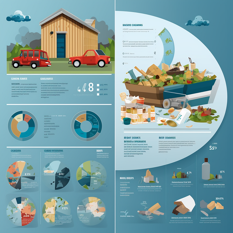
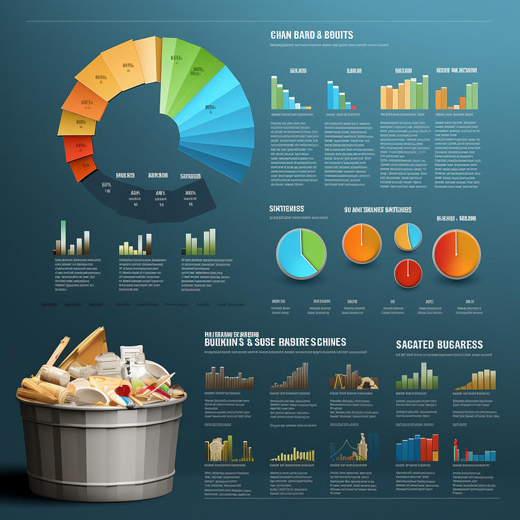
Data Visualization of Waste Management Statistics

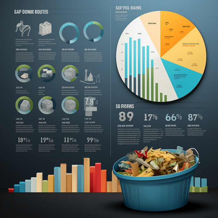
These images display a sophisticated infographic with a variety of charts and graphs detailing statistics related to waste management. In the upper section, there's a collection of circular diagrams and bar graphs, including a large pie chart on the right labeled "SUP PIB RAING," possibly representing different categories of waste or recycling rates. Below, a three-dimensional bar graph stretches across the image, providing a comparative view of data points in multiple colors, suggesting trends or quantities in waste management. To the right, there are percentages that likely indicate efficiency rates or goals met within the system. In the foreground, a realistic image of a blue recycling bin filled with assorted waste items offers a stark contrast to the clean, numerical data behind it, emphasizing the tangible outcome of the data presented. This juxtaposition serves as a powerful visual representation of the raw material that waste management statistics are based on.