


Soda Can Design - Beverage Packaging


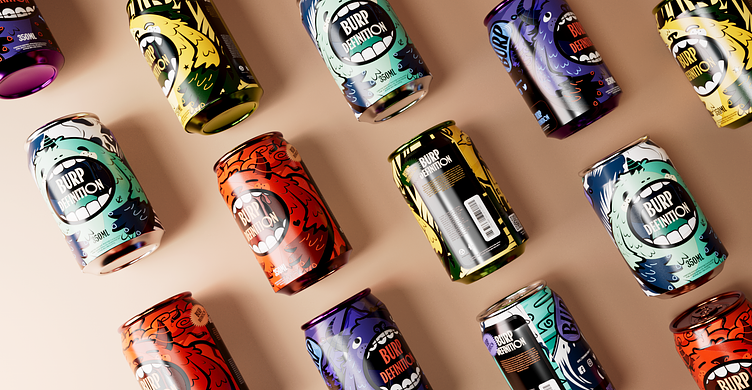
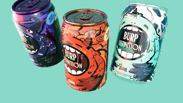
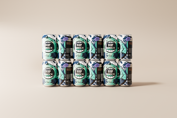
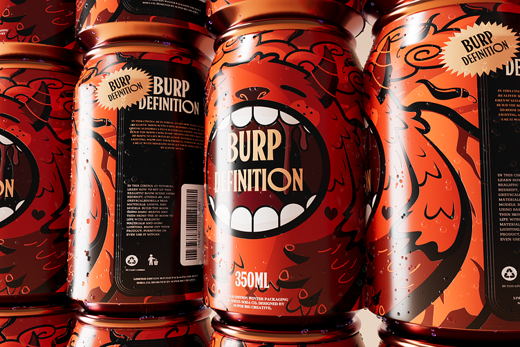
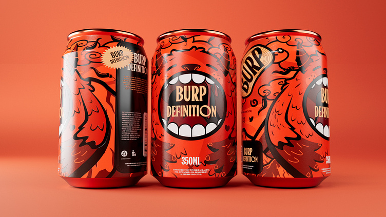
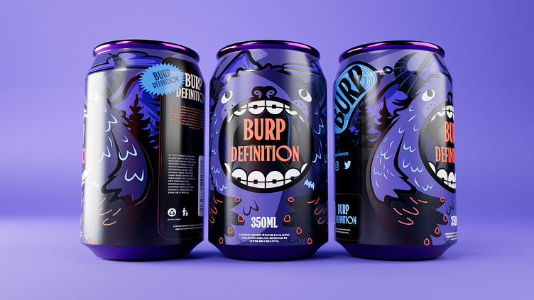
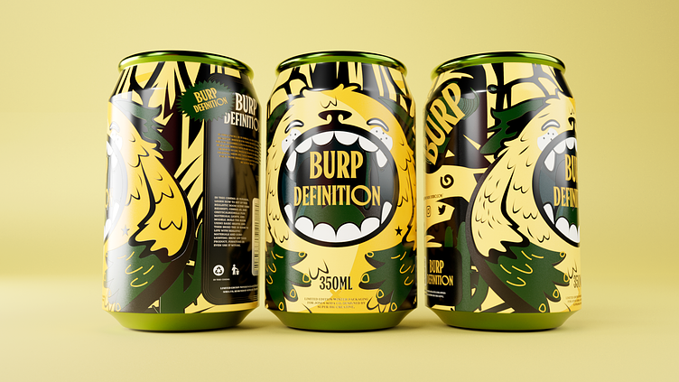
Burp Definition was created to appeal to Zillennials who are keen on early adopters, advocating individuality, express themselves, and pursue a healthy lifestyle with its unique flavors, exciting mouthfeel and healthy products with zero calories and zero sugar. Each flavor is a blend of one traditional spice and one aromatic fruit. The seemingly far-fetched mashup can be perfectly integrated. The collision of tradition and trend, the combination of simplicity and modernity are its essence.
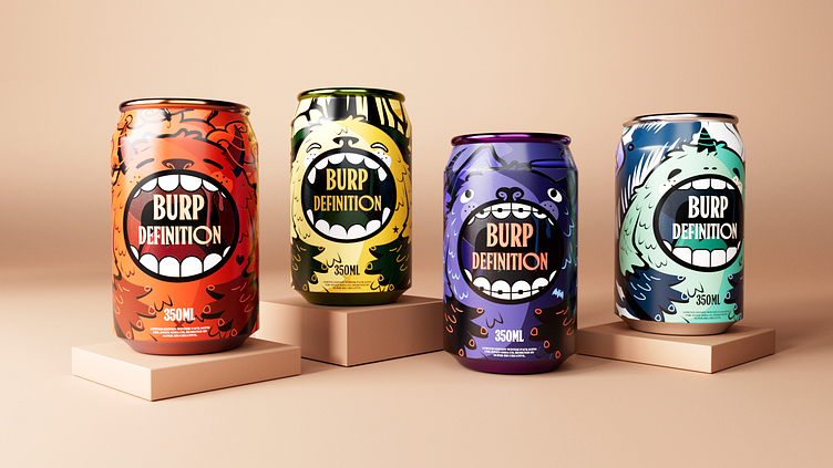
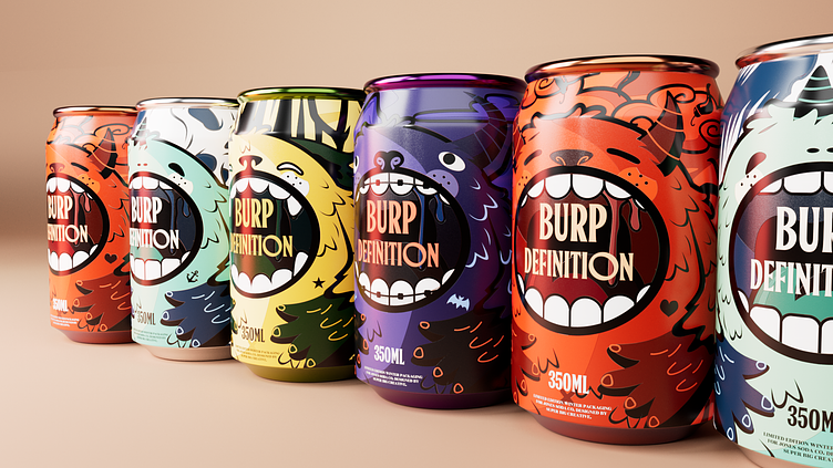
The core concept of the design is the Nine Sons of the Dragon. There are nine models in the whole series, and the first four models have been released so far, corresponding to the Sons of the Dragon: 囚牛 Qiuniu the Bull, 螭吻 Chiwen the Fish, 狻猊 Suanni the Lion, and 睚眦 Yazi the Wolf. In order to carry forward the brand concept, we modernized the traditional cultural elements to convey the collision of tradition and trend. Without choosing common traditional images of the Sons of the Dragon, we re-given them new images based on the character traits, habits and attributes. Each flavor matches the characteristics of its corresponding dragon son. They are either gentle, or elegant, or brutal, or violent, but all of them exude mysterious charm and demonstrate the magical and unique brand temperament.


Services provided:
Branding Design
Packaging Design
Illustration
—
Have a project you'd like to collaborate on?
Contact us: info@marcatostudio.com
—