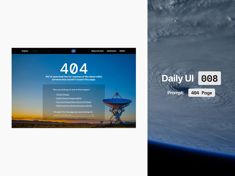
Daily UI 008 - 404 Page

Houston, we've had a problem..
I wanted to use this quote as the 404 message but felt it was arguably in poor taste of a life-threatening incident, and didn't think it was something NASA would use in their design. Instead, I opted for something a little more lighthearted.
Make it helpful.
In my time working in UX, I've come across a ton of 404 pages and seen users struggle with broken links and being unsure of what to do next. It's an issue that will last as long as we have the internet.
One thing I always spoke to clients about was working on making a 404 page as useful as possible. It's something that's hard to get right, and there are various ways to go about it.
You could go the 'fun' route and have some quirky message and then link back to the homepage.
This is not helpful to the end user, despite often being the most visually appealing. As a user of the internet
The homepage is never the page I was looking for when I found the 404 error, so that link is almost always useless.
You could go for a somewhat helpful approach and offer some links to common pages that users often view.
The issue with this is that the user likely wasn't looking for your most popular categories - they're linked everywhere and very accessible. So this approach tends to only be somewhat helpful.
Or you can go for a very helpful approach and offer links related to the page the user tried to visit as well as offering them a search box to search for it. Ideally there should be a contact link nearby as well in case the user is really stuck. In the NASA example, they have a their full footer on the 404 page, which I think is a great approach.
This approach would take the URL string that led to the 404 page and essentially perform a search for the user, offering them pages relevant to said string. The theory here is that with any luck it will bring up the right page, or at least some relevant information. If not, we give them a search field and let them do their own version of a search.
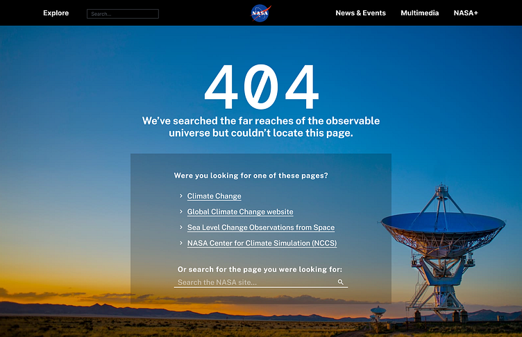
Utilitarian approach
You can see I opted for what I called the 'very helpful' approach above. My design implied the user was looking for something climate change related and offered some links to these pages.
I used the same fonts and colours from the NASA site (see below), and threw a quick navbar together.
I still wanted to use something a little bit quirky, as I know NASA love their tongue-in-cheek comments from what I see from them online, so I came up with a comment about the page not being in the observable universe.
Honestly, the page isn't too dissimilar from their existing 404 page but mine is more utilitarian and helpful in getting the user to where they wanted to be.
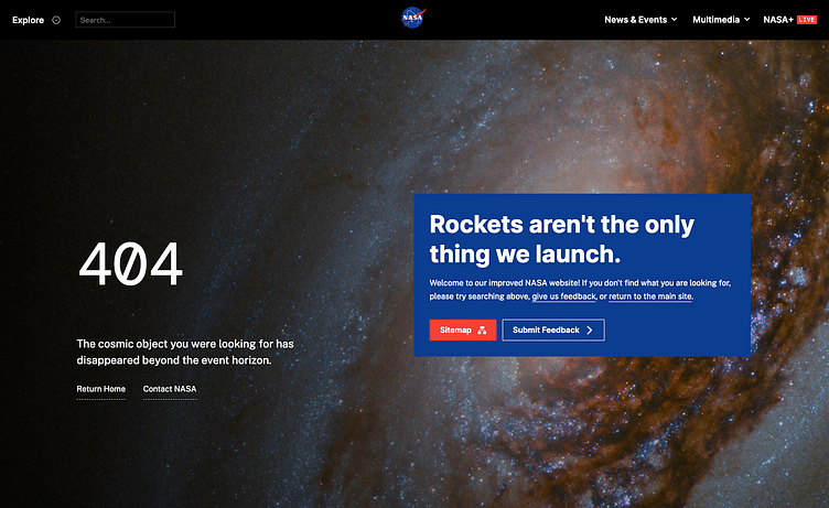
NASA's current 404 page
The page itself is okay, it looks nice enough, but it doesn't really help me to get to where I actually wanted to go, hence me wanting to do a redesign.