Longman & Fernandes <> Brand

This project aimed to design the Longman & Fernandes brand, a brazilian law firm. Our focus was to boost the company's digital transformation. In order to strengthen the entry of potential customers into the sales funnel through the activation of their digital platforms.

The inspirations were gathered on a Pinterest board. Seeking to communicate seriousness, sobriety and efficiency to attract the trust of the office's target audience, the search for similar products brought together sober and minimalist brands.

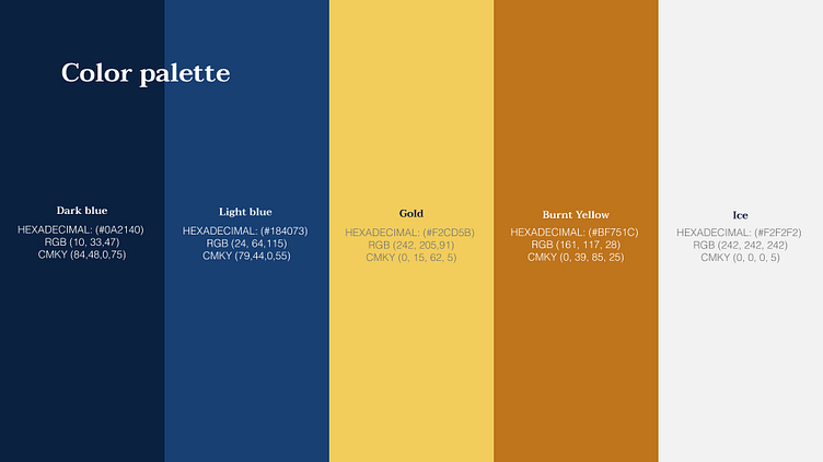
One of the first definitions was the color palette. The use of sober colors that convey seriousness and at the same time allow for the construction of graphic pieces with high contrast, in order to facilitate reading, were key points in this choice.
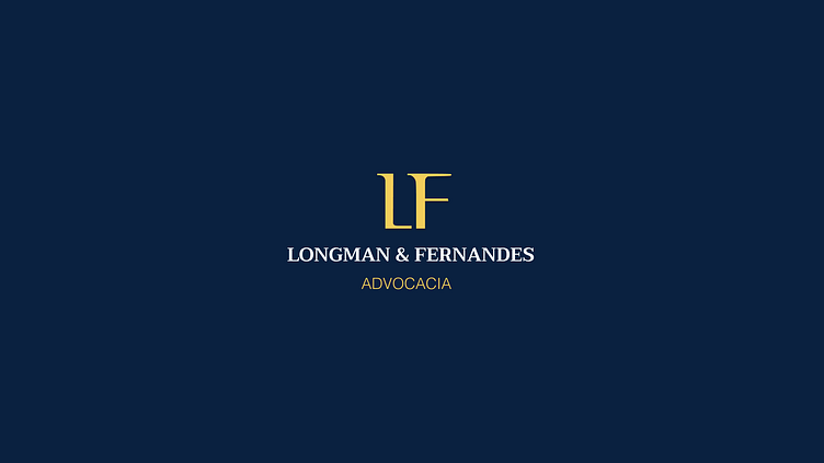
After a few versions were presented, the clients opted for a minimalist, typographic-based brand, you can check out the vertical version below.

In order to exemplify how the brand application could be carried out, I created some fictional pieces for social media.

Finally, I made an application on cardboard, an artifact still widely used by lawyers in Brasil.

So, what do you think?
Tell me in the comments, I'd love to know.