SAAS Website (Features & Pricing Plans)

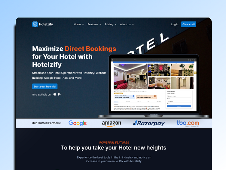
The uploaded webpage design for "Hotelzify" leverages a dark theme, combining deep blues with black backgrounds to create a sleek and professional look. The color palette is energized with splashes of orange for buttons and call-to-action elements, providing a vibrant contrast that guides the user's eye.
Typography across the site is modern and clean, employing a sans-serif font that enhances readability and aids in the visual hierarchy of information. Headings are bold and assertive, while body text is more subdued, ensuring users can easily navigate through content.
At the top, a minimalistic navigation bar offers clear pathways to the website's main sections, including a prominently displayed 'Get Started' button, signaling the primary user action. This leads into the hero section, which boasts a large image slider depicting the platform's interface, accompanied by a succinct tagline that underscores the benefit of direct hotel bookings.
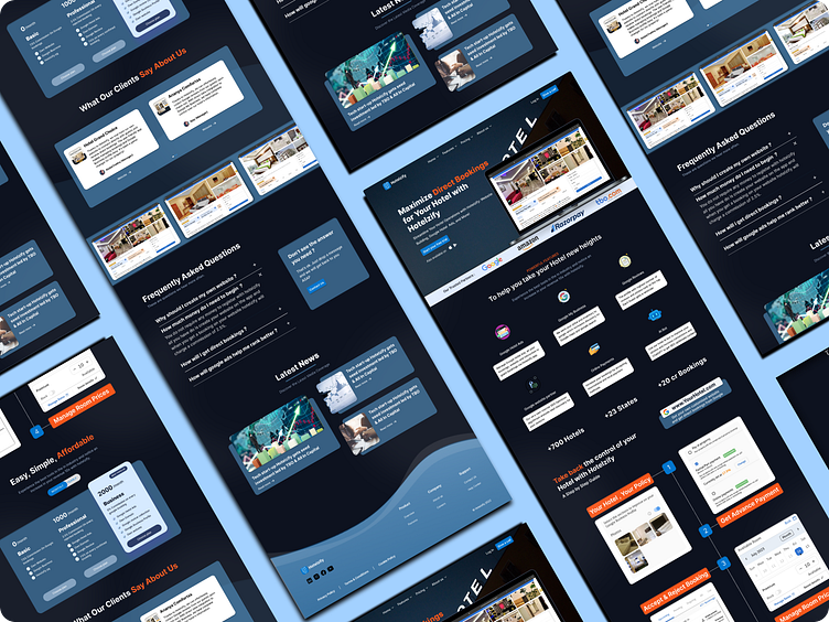
The features of the service are neatly summarized using crisp iconography and concise text, making the value propositions immediately apparent. This is followed by a visual, step-by-step guide outlining the simple process for hoteliers to manage their bookings, each step illustrated with an intuitive icon.
A structured pricing tier list presents the Basic, Professional, and Business plans, each detailed with included features and an inviting 'Get Started' call to action. Customer testimonials are tastefully curated in a carousel format, lending credibility through real user experiences and photos.
Towards the bottom, an accordion-style FAQ section provides quick answers to common queries, adjacent to a 'Latest News' segment showcasing the company's milestones and updates. The footer rounds off the design, offering Terms & Condition links and essential legal information without cluttering the space.
Visually, the design employs cards, subtle shadows, and generous spacing to delineate sections clearly, creating a clean and orderly layout that invites exploration. The precise alignment of icons, buttons, and images suggests a focus on a user-friendly experience that likely extends to responsive design, ensuring functionality across various devices.
In this showcase, while static, the design's potential for interactive elements such as hover effects and smooth transitions is implied, which would be pivotal in enhancing user engagement on the live site.
Wanna collaborate with me? Shoot your business inquiry to