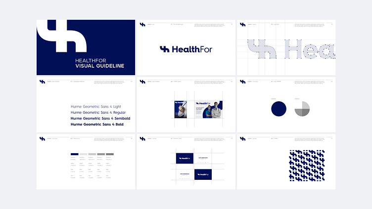
HealthFor Visual Guideline

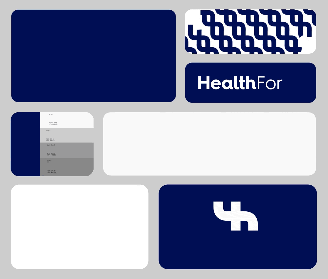
The logo mark symbolizes our commitment by merging 'plus-health' elements, emphasizing healthcare connections, connecting individuals with high quality health solutions.
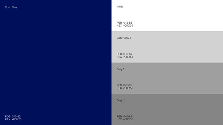
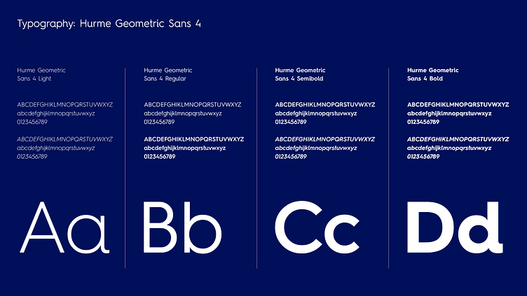
Health For's visual identity centers on a soothing blue palette, symbolizing trust and well-being. The geometric sans font chosen emphasizes our commitment to simplicity and reliability. This intentional blend creates a visually appealing brand aligned with our core values.
Let's work together!
— Do you have a project? 📩 info@overoverdesign.com