Case Study: Trade Republic


User feedback points to several obstacles in the new layout, suggesting it's too complicated. By simplifying it with clearer, more user-friendly choices, we could boost engagement and keep more users from abandoning the app. A 10% increase in users embracing the new layout could signal its success.

Today, I'll focus on three topics:
Changing Component Colors
Switching Layout Modes
Finding the Analytics
1. Changing Component Colors
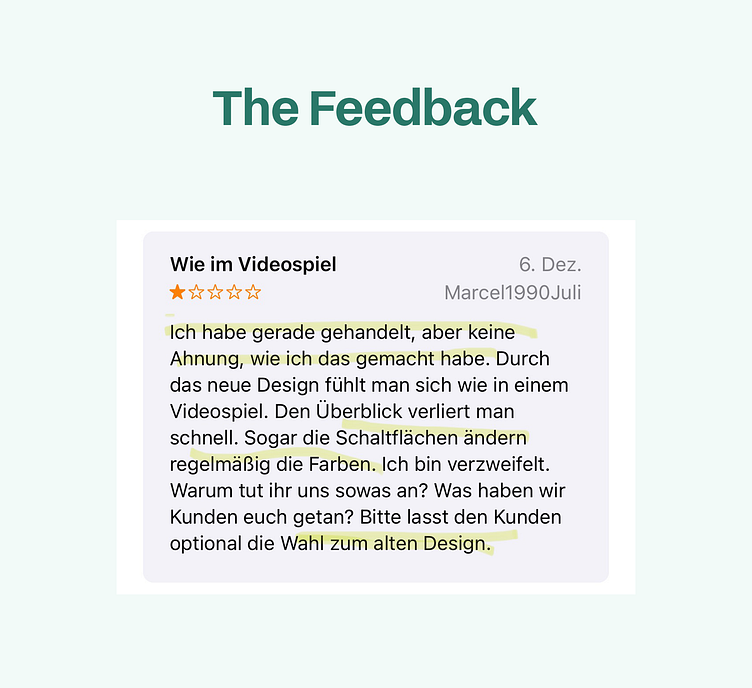
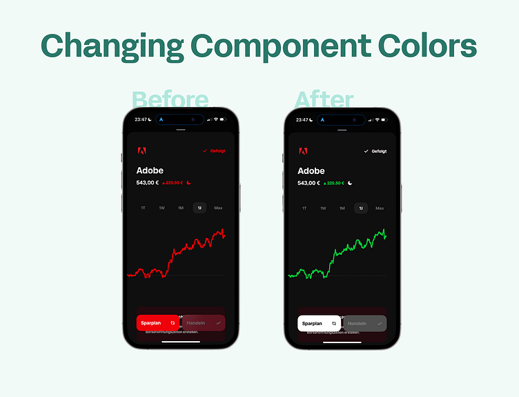
📍 Currently, in the "logo mode" (default) both the button and graph colors change to match the corporate design of the company whose stock shares are being viewed.
✅ This helps users recognize which stock they're in and underscores transitions between different stocks.
❌ The design lacks consistency:
Users are confused.
Accessibility is compromised.
It can appear unprofessional, impacting trust in the app.
It's particularly confusing for companies with 'alarm' colors, like Adobe's red. For instance, a graph showing growth (which is positive) displayed in alarming red can create a conflicting feeling for the user, as it doesn't align with the positive context.
🙁 Users view the frequent color changes as arbitrary, and the effects of inconsistent design are explicitly shared in feedback to Trade Republic.
🙂 Solution: Maintain a consistent design.

2. Switching Layout Modes
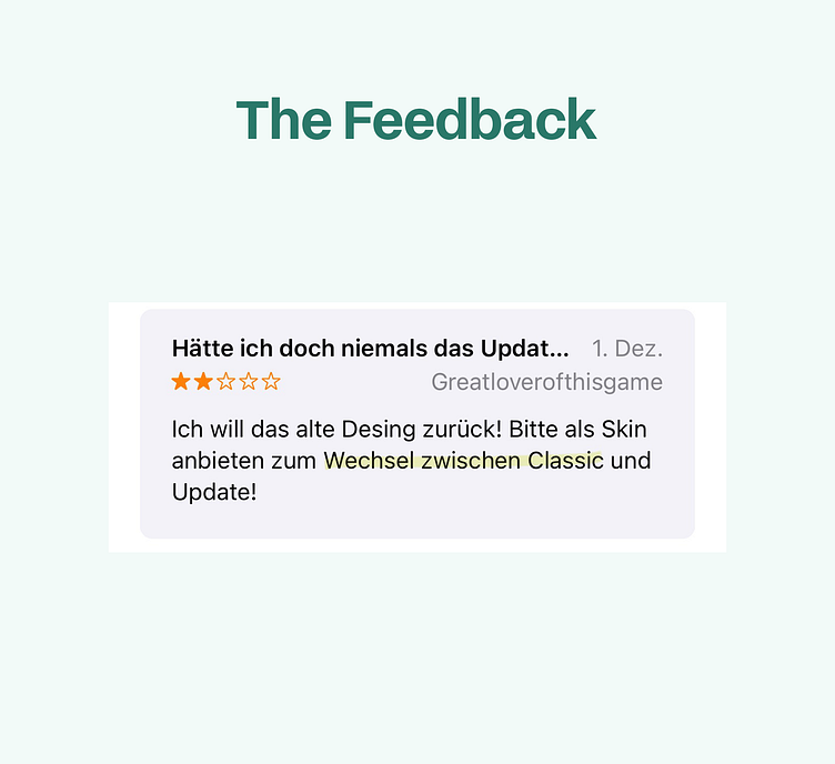
🙁 Users want the old design back, with many requesting an option to revert to it.
📍 An option to switch designs already exists, not to the old design but between a "logo mode" (default) and a "performance mode," similar to the old design. However, users still asking for this feature suggests they can't find it or are unaware of its existence.
✅ The ability to switch designs enhances user experience by allowing personalization and greater control over the interface, catering to different preferences and needs.
❌ Reasons users might not find or know about this option include:
The profile icon may be overlooked and not recognized.
Users might see the profile icon but not link it to settings.
No typical settings icon like a gear indicates settings are available.
🙂 Solution: Rearrange the functionalities.Heading
Enter your text here...


3. Finding the Analytics
🙁 Users struggle to locate the often-used analytics feature, finding it too hidden.
📍 Analytics are accessed by scrolling both vertically and horizontally, which doesn't emphasize their importance in the layout.
✅ Creating a clear hierarchy based on usage can prevent users from feeling overwhelmed.
❌ The current layout's hierarchy doesn't match user priorities.
🙂 Solution: Reposition the analytics feature for easier access.

Hire me.
Looking to enhance your products as well? - Hire me. (recommended)
Cheers, your smart future coworker Franzi 🥂