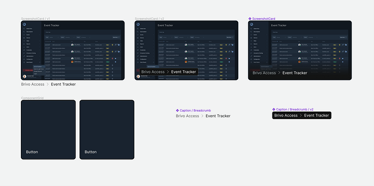
Card Component ideation
created 3 different versions of a card component (screenshot + text overlay or beneath). Just laid out the styles here.
Pretty basic approach. Ended up using the third card: liked the dark gradient along the bottom to emphasize the text. (Just remember to set Figma's Constraints to "left and right" to make the absolute positioned text layer stay responsive)
View all tags
Posted on
Dec 19, 2023
More by Matt Richards View profile
Like

