Creams and Crackers

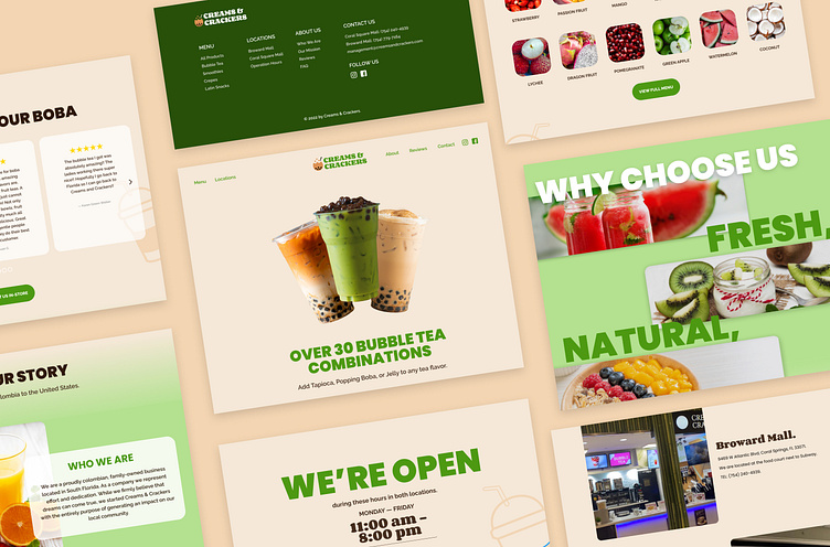

I reached out to “Creams and Crackers,” a local bubble tea shop, because I loved their artisanal products. Yet, I noticed that their web design needed a refresh. They struggled with clarity, short-term memory overload, and design principles. These issues are addressed in the new design by increasing the negative space, structuring information in concise fragments, and creating a grid that is consistent throughout the website.
Skills used
Branding
UX/UI
The problem
The current design was crowded, inconsistent, and interfered with accessibility.
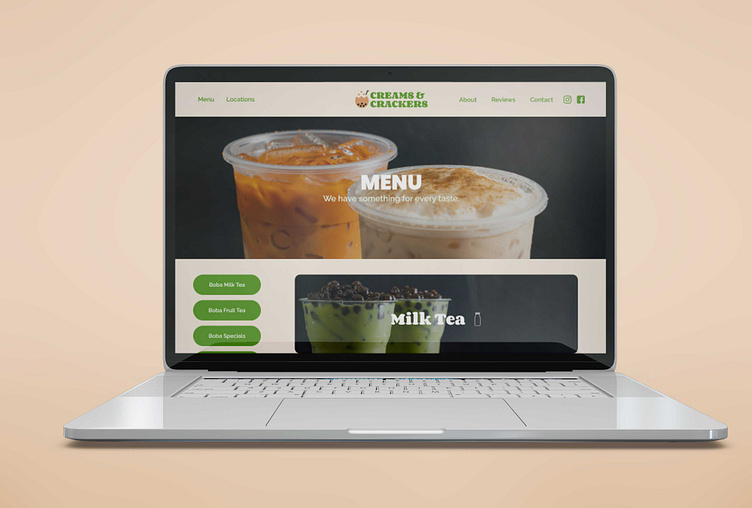
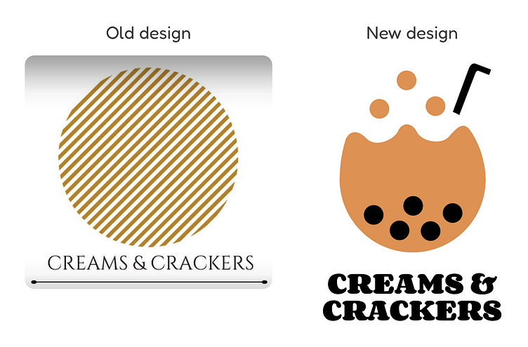
Logo
I updated their logo to represent the main product sell (bubble tea, smoothies, and cookies) in a simplistic and friendly manner to help company’s identification.
The landing page
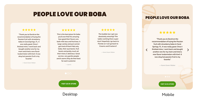
I added a distinctive module to the homepage to highlight the unique components of the company against its competitors, and I introduced a reviews module to increase social proof and reliability to encourage the purchase of products.
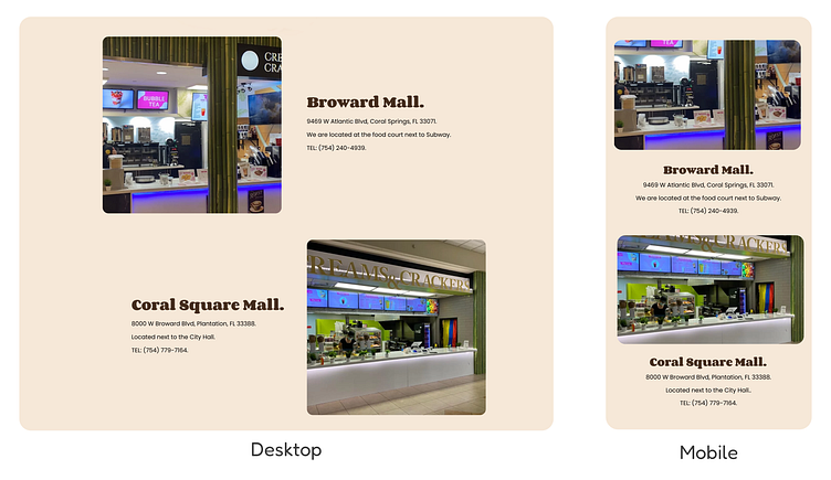
I moved the stores’ locations to the homepage for easier accessibility while adding visual cues to optimize stores’ recognition.
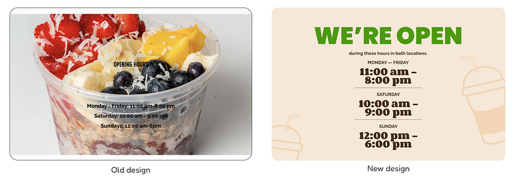
I added clarification to the operation hours schedule and improved readability by using hierarchy of elements to ease user’s information intake.
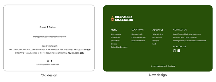
I reorganized the footer for easier navigation between the different sections of website.
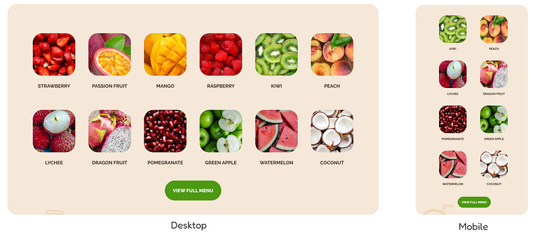
The Menu
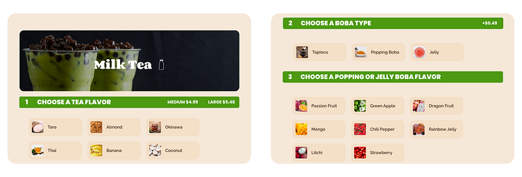
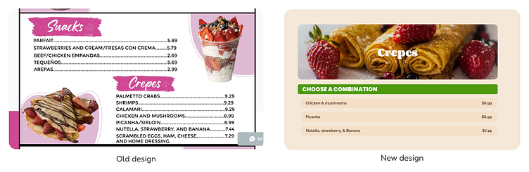
I structured the menu in a step-by-step layout to avoid short-term memory overload and overwhelm the user with information. In addition, I also constructed a constant and legible grid throughout the menu to prevent crowdedness while allowing easy future iteration of items.