Daily UI (8/100): 404 Error Page

NOTHING HERE TO SEE. MOVE ON. Today's daily UI challenge is to design a 404 Error Page. According to the Nielsen Norman Group, there are 3 basic guidelines for creating an error message:
Write it in plain language that is easy to understand for non-technical users and that does not imply that the mistake is the user's fault.
Make it precise in specifying exactly what was done wrong (that is, not be generic or vague).
Suggest constructive steps that the user can take to correct the problem.
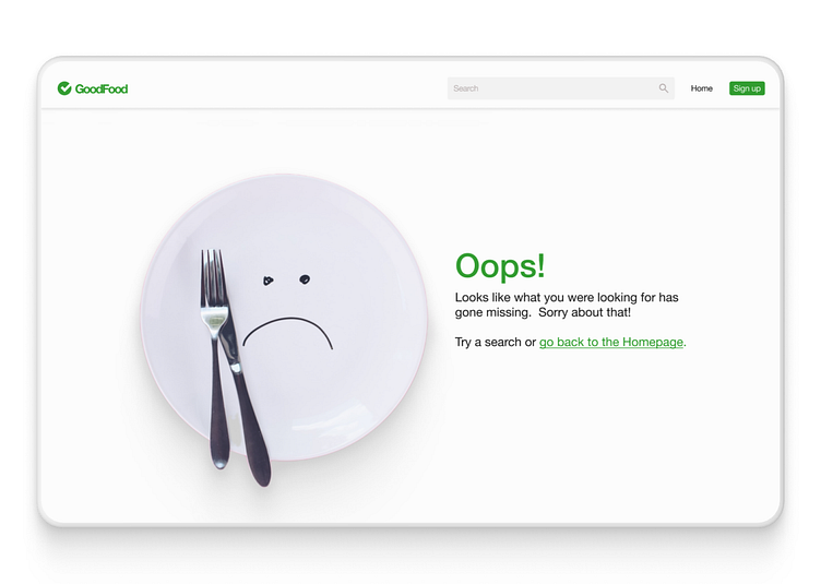
I think that I've ticked off everything on that checklist with my solution. And in case you're wondering why I left out the dreaded "404 Not Found" message in my design, I did it for a good reason. Having it there would violate one of the guidelines.
I don't argue with Don Norman or Jakob Nielsen. I suggest you don't either.
Just in case you're wondering, the site that I designed this for is GoodFood, my MVP for my recent product management class. Like always, I'd love to hear your feedback. Anything you think I could add or subtract from my design to make it better?