Case Study: Vancouver Art Gallery


BACKGROUND: The Vancouver Art Gallery is a distinguished art museum situated in Vancouver, British Columbia, Canada. Renowned for showcasing the creations of pioneering contemporary artists on a global scale, the institution also curates exhibitions of historical art possessing international significance. Visitors are invited to join exhibition tours and engage in events hosted by the gallery.
CHALLENGE: The website of the Vancouver Art Gallery (VAG) has a complex user flow and lacks design coherence. The navigation system, coupled with inconsistent utilization of imagery and typography, results in a disconcerting and overwhelming presentation of information. Furthermore, the transition from desktop to mobile interfaces lacks fluidity and does not adequately account for the variations in screen sizes (Original Website: Vancouver Art Gallery).
GOAL: As part of a self-driven project, my goal was to analyze the UX challenges present in the VAG’s website and, ultimately, address these issues by crafting responsive designs that are more accessible and user-friendly.
RESPONSIBILITIES: Conducting user research, paper and digital wireframing, conducting usability studies, low- and high-fidelity prototyping, iterating on designs, and responsive designs.
Usability Research
Following a comprehensive usability study of the Vancouver Art Gallery's existing website, I gained valuable insights into the distinct user frustrations encountered.
Noteworthy findings include:
Complicated Navigation
The navigation structure contains 6 primary menu items and 29 sub-menu items. Each sub-menu item inconsistently directs users to individual pages, many of which offer minimal information. This approach requires multiple clicks, leading to user frustration as they navigate through various pages in search of specific info.
Inconsistent Designs
The inconsistent utilization of typography and imagery throughout the website presents a challenge, causing confusion and hindering the ease of interpreting information. This lack of design uniformity contributes to difficulties in user orientation and familiarity.
Challenging Mobile Experience
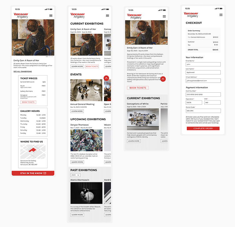
The layout of information does not account for an optimal mobile experience, leading to user frustration. The current design does not effectively adapt to mobile devices, impeding users in accessing information seamlessly.

Paper Wireframes & Low-Fidelity Prototypes
I chose my favourite aspects of my paper wireframes to build a low-fidelity digital prototype which was then used to test usability.


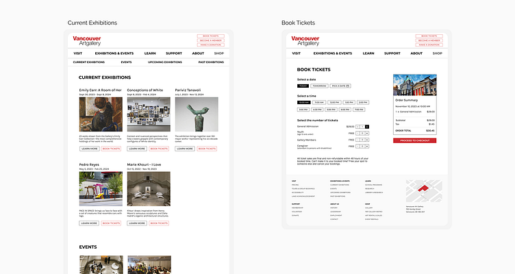
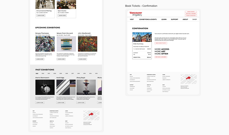
Final Desktop Design - LAUNCH PROTOTYPE


Final Mobile Design - LAUNCH PROTOTYPE