Turntable Media Branding

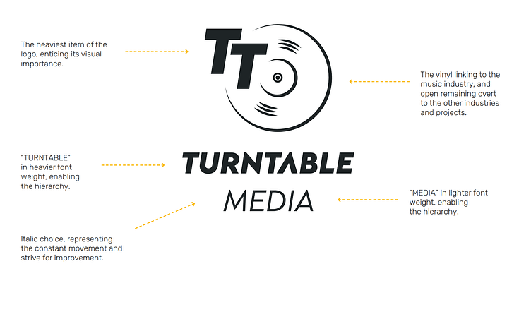
As a new company, our goal was to quickly establish the industry values we want to emulate. With that in mind, alongside the team, we developed a branding concept where we showcased forward thinking and constant movement, with the aid of italic fonts.
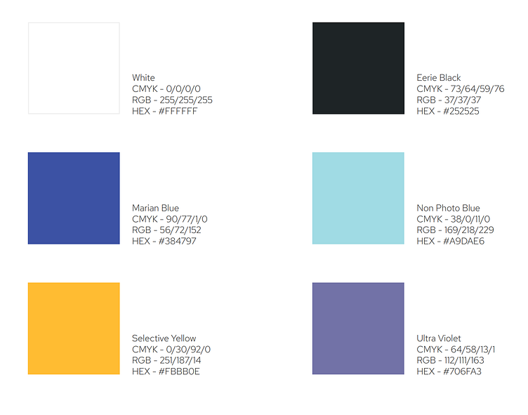
Typography & Colours
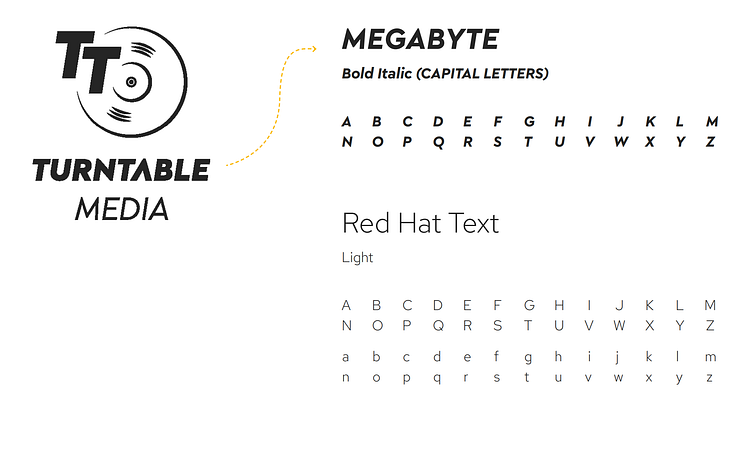
We knew that the italic identity was going to be perpetuated, but to not tire the user or remain monotone, I suggested to the team combining the font used in the logo with the a secondary font, non-italic, creating a working contrast.
Logo Development
The vinyl. A powerful icon showcasing the importance of the music industry in our lives. The vinyl itself connects us to the historic moment where music started inspiring generations in the comfort of their homes, where we explore different sounds and groundbreaking melodies
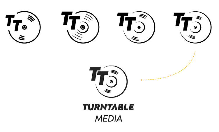
To combine it with Turntable Media, hence the “TT”, was a privilege considering the we were inspired from the beginning by how Turntable Media would like to be visually represented, what values would they want to imprint on their clients. The fading of the vinyl as it edges closer to the “TT” represents how interlinked music and media platforms are connected nowadays, while leading the eye of the client towards the subliminal text.
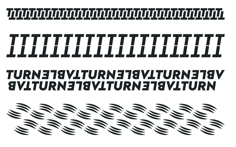
Brand Patterns
Patterns remain a simple but effective tool in the completion of a brand identity, as they help establishing cohesion throughout the different visual assets in a subtle manner.
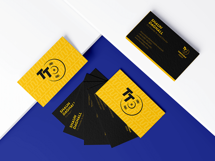
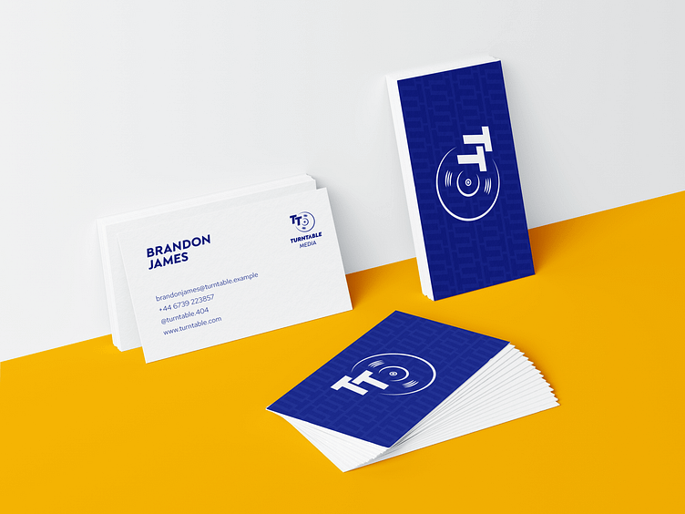
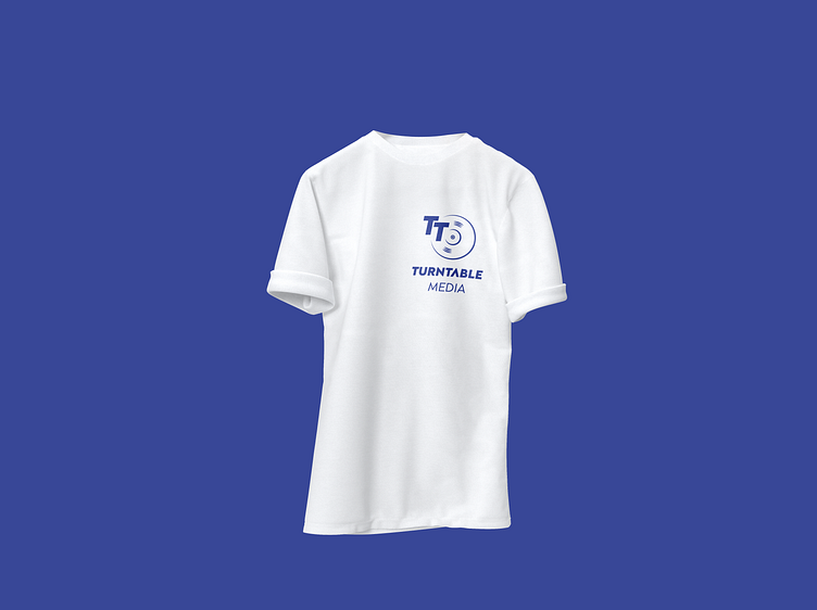
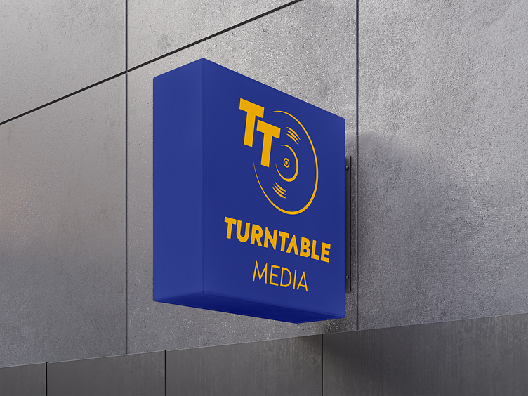
Brand Aplications