Odysys

I was tasked with redesigning odysys.com, simplifying the old website structure, and scrapping most of the accumulated content over the years. We created a new narrative with Odysys's marketing team, rebuilt the site’s information architecture, and streamlined visitors' experience.
Visite site
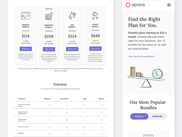
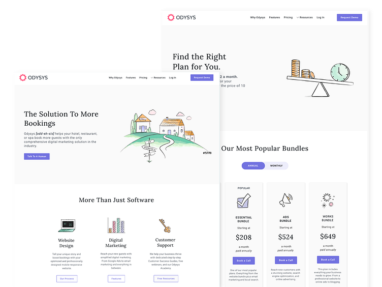
Intentional updates helped achieve a more human, friendly experience for users
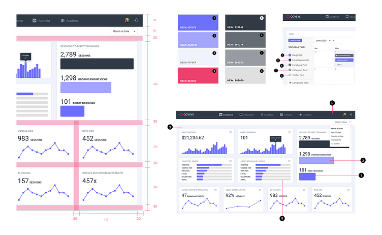
A shift in the color palette usage from bright pink and dark purple to a softer, minimal approach. These updates were essential to achieve a more human and friendly experience, which is reflected in the digital brand guidelines available on the website. The guidelines include easy-to-download logo and font files. Additionally, I also oversaw an update to the UI of their client portal and dashboard, bringing it up-to-date with the latest design trends.