ESA Redesign Concept

Redesign Concept 🚀
Due to my interest in the topic of space exploration and analog missions, which were the subject of my diploma project during my design studies, I regularly visited websites dedicated to this subject. One of my frequent points of visitation was the website of the European Space Agency (ESA).
Despite a thorough redesign and visual improvements, as well as adaptation to Responsive Web Design (RWD) standards, in my opinion, the ESA website still had room for functional enhancement.
The scattered navigation, located in several different panels, and a lack of logical continuity in navigating between subpages, along with sometimes unclear thematic categorization in tabs, led me to design my own concept of the website. The primary focus was on ensuring clarity in information architecture and a user-friendly experience, especially for new visitors.

Navigation 🧭
The main challenge was the multitude and quantity of subpages contained within such a complex website, belonging to a large organization that brings together many different entities.
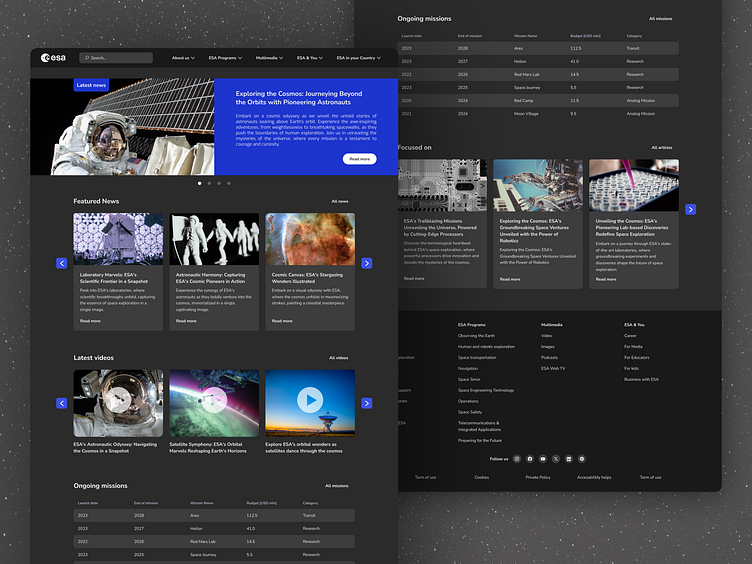
My main goal was to have the entire navigation fit into a single top bar, condensed into a few main tabs/categories, allowing users to quickly grasp the hierarchical structure of the entire site.
To achieve this, I prioritized and rearranged the previous layout to condense and create a new, easier navigation map for the site as much as possible.
Given that each ESA member country has its own subpage, which is a crucial element of communication with users from that country in their native language, I brought this tab to the forefront. Previously, it was hidden in tertiary navigation.
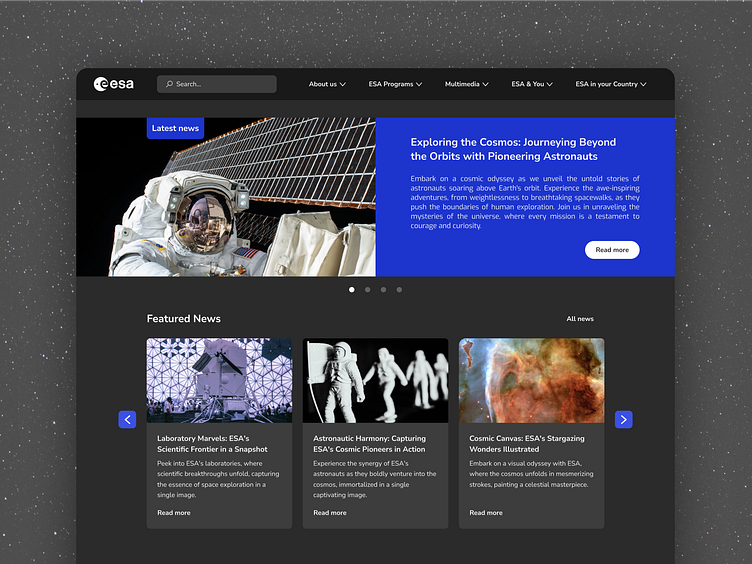
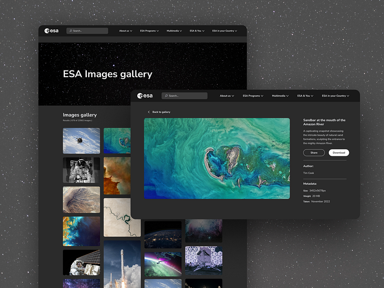
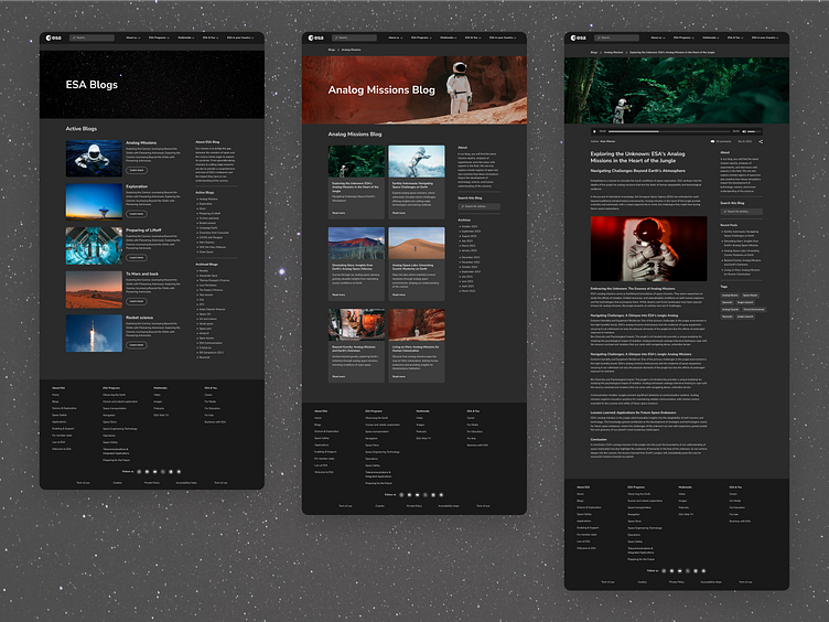
UI and Prototyping 🌚
Due to the fact that in today's times, an increasing number of people use or prefer dark mode because it is less straining on our eyes, and at the same time, this mode is more closely associated with the theme of space, it was obvious for me to design the website in dark mode.
Giving it a new visual style based on good practices of Design System, I also created clickable happy paths in Figma to better visualize the overall user experience during interactions with the website.