Livo - Real Estate Visual Identity


Hi Folks!
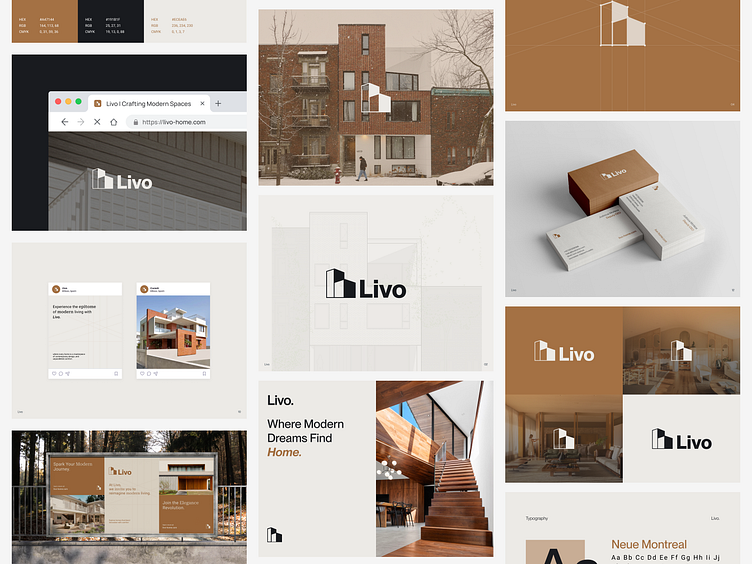
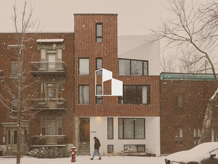
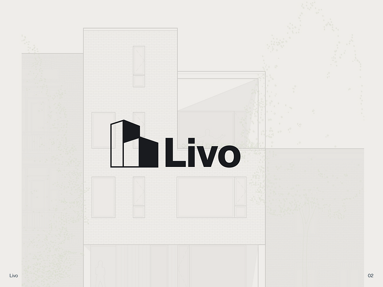
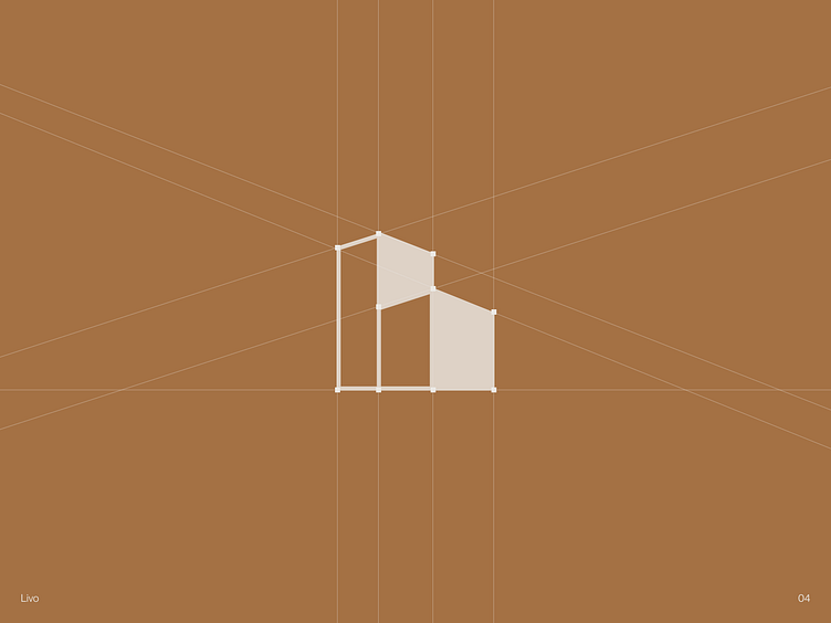
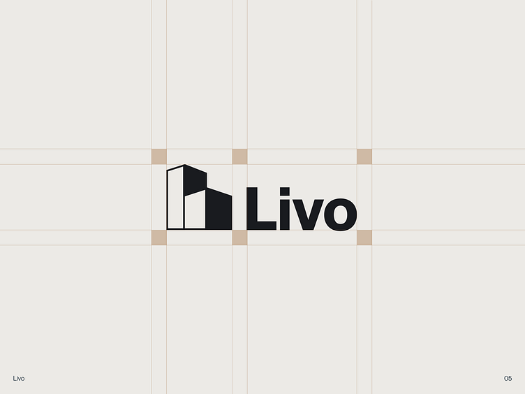
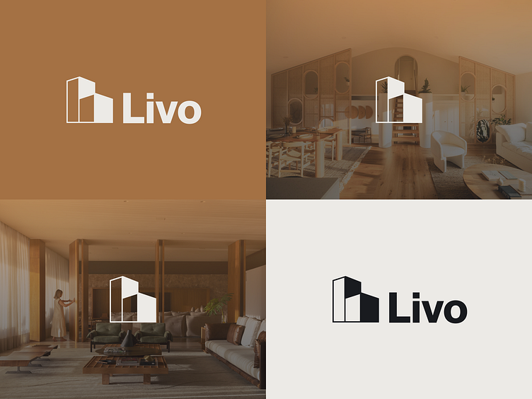
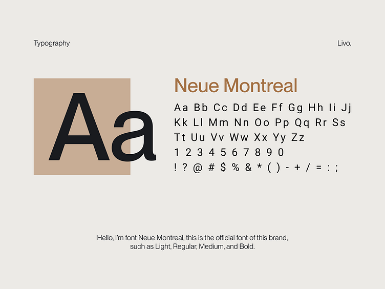
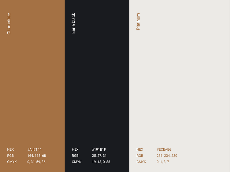
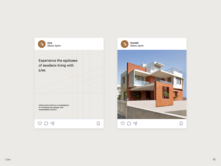
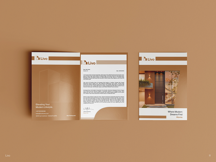
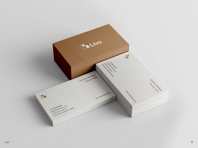
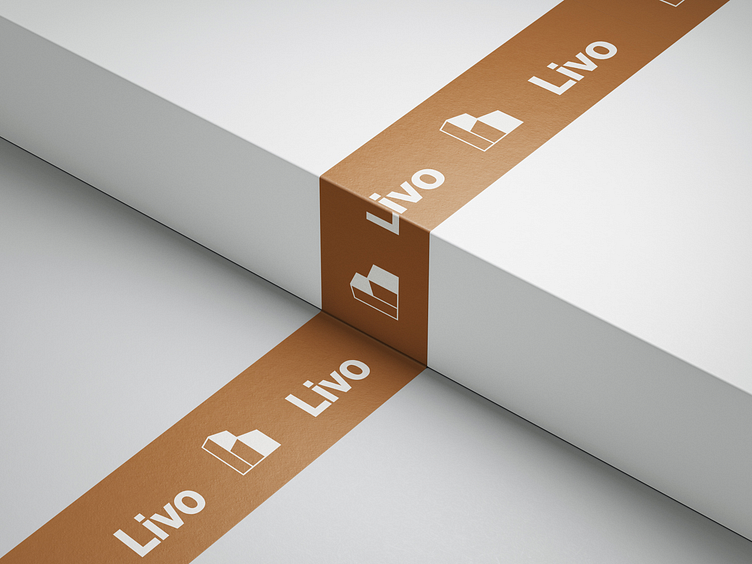
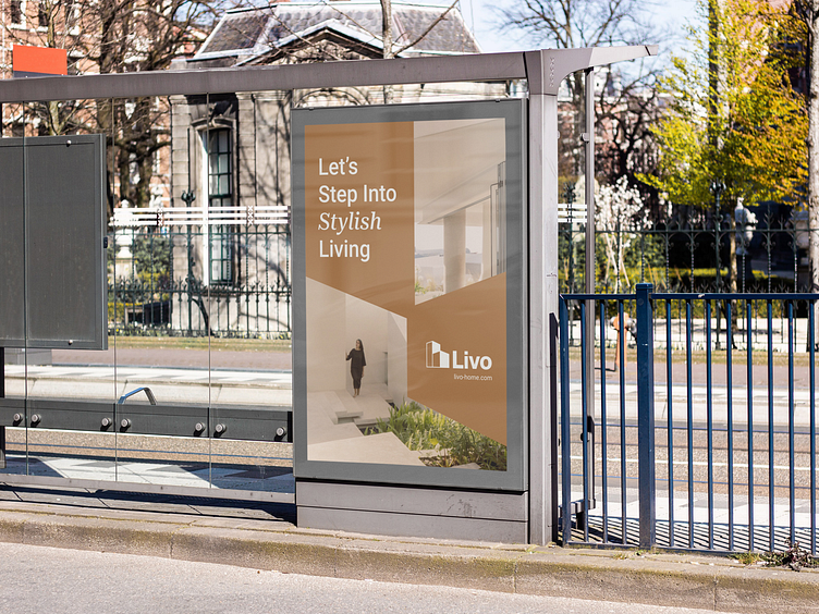
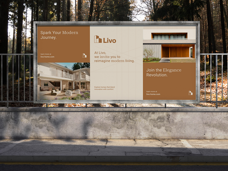
I'd like to share my visual brand identity exploration here, and it's called Livo. I've chosen brown as the main color to resonate with the brand, symbolizing home design. Given the current popularity of Scandinavian design, which often incorporates brown hues, this choice aims to capture that aesthetic. For the logo, my inspiration comes from flats, symbolizing house construction.

Thanks for checking it out!
Interested in partnering with us?
Say hello at hellodama@odama.io
or visit our website odama.io
Check us more at:
📷 Instagram | 🛒 Gumroad | 🎉 Figma Community | 🛍 Creative Market