Kota Logo Design

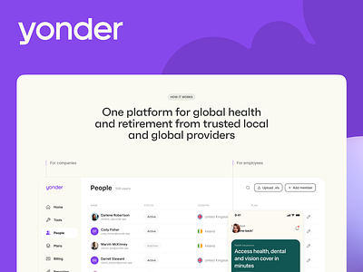
Kota helps companies streamline and manage their employee's health insurance and retirement benefits in a modern way. They approached me for a new logo because of a change in name. Significa already did the hard work of creating a stellar brand.
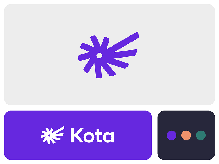
The new symbol is based on a nautilus shell. I liked it because the inside starts small but then grows exponentially as it moves outwards. A neat metaphor for retirement savings, plus shells have been used as a form of money in many ancient civilizations.
Again, kudo's to Significa for their work on the colors, typeface, and everything else.