Revisit - Logo Design for the Travel Agency

👉About Company:
Revisit saves people time and airport stress, by making private flights and private airports more accessible. Their simple app pairs pilots and no-nonsense travelers who prefer transparent, real-time pricing, without gimmicks, middlemen, or membership fees.
👉Logo Story:
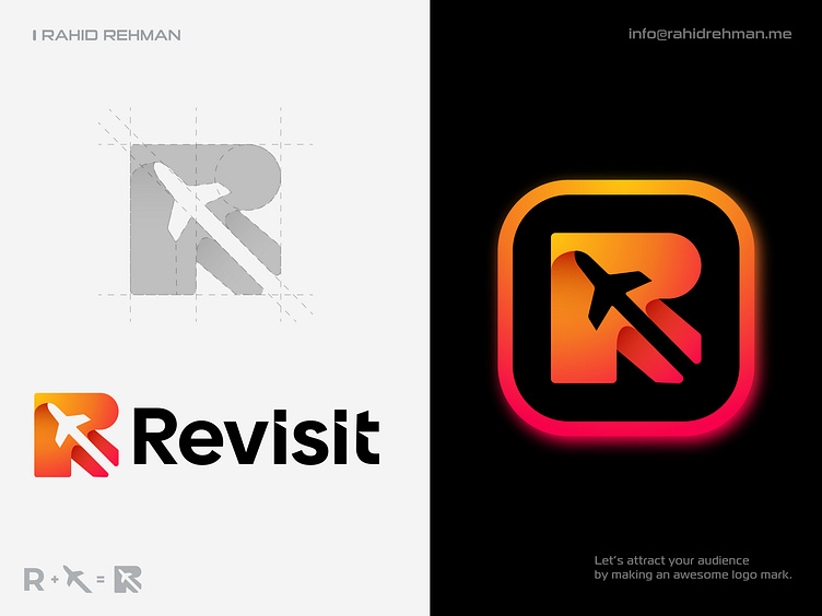
The iconic mark is a combination of the Letter R which is the 1st initial letter of the agency name and the plane icon.
👉Color Psychology:
Orange suggests fun and adventure, it's frequently used for hotels, travel companies, and resorts. It encourages social communication with companies, as it's more approachable than red. Depending on the shade and accompanying colors used, orange is also used in business to indicate affordability.
Feel free to share your opinions about this concept. Have a great day.
____________________________________________________________________________________________________
👉 Let's work together and elevate your brand!
Email: info@rahidrehman.me
WhatsApp: https://wa.me/+8801705553455
Telegram: Rahiddesigner
Website: www.rahidrehman.me
___________________________________________________________________
Thank you,
Rahid
© Rahid Rehman