PensionBee Homepage

Revisiting some of my past design explorations, I came across this take-home task from an interview process – a subtle redesign of the PensionBee app interface. It’s a snapshot of work that’s usually not front and center but contributes to our growth as designers.
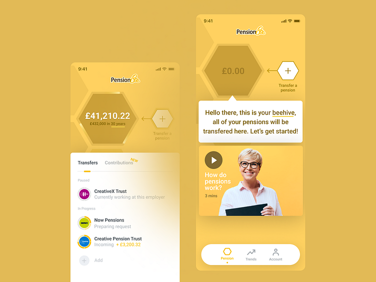
In this iteration, I incorporated the honeycomb theme of PensionBee to simplify the layout, focusing on user ease for pension transfers.
Looking back, it's interesting to reflect on the evolution of ideas and how even the concepts that don't make it past the cutting room floor can inform future work.
Curious to hear from others – do you revisit past designs? How do they inform your current work?