La Marine — Case — Brand Identity & Strategy & Packaging D

La Marine — Brand Identity & Strategy & Packaging Design
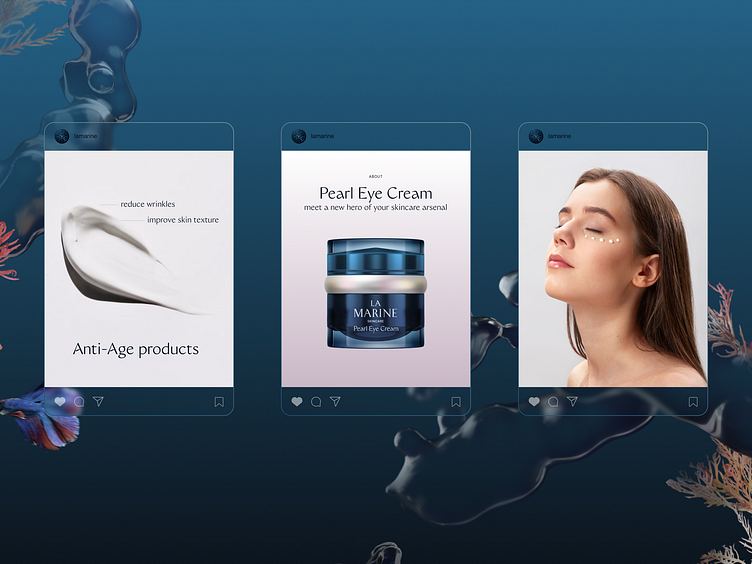
Client: La Marine Skincare
Services: Product Strategy, Brand Strategy, Positioning, Naming, Brand Identity, Packaging Design, Web Design
Sphere: Beauty
La Marine is a brand of natural, anti-ageing cosmetics with ocean ingredients, founded by two business partners from the Ukrainian city — Odesa. They approached us with the goal of creating a natural cosmetics brand for women aged 35+, which would be sold on international platforms in the United States and Europe.
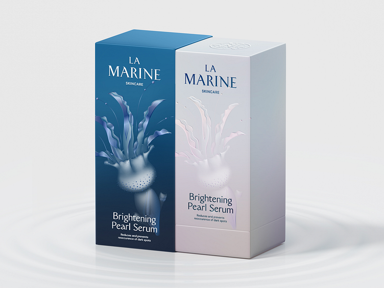
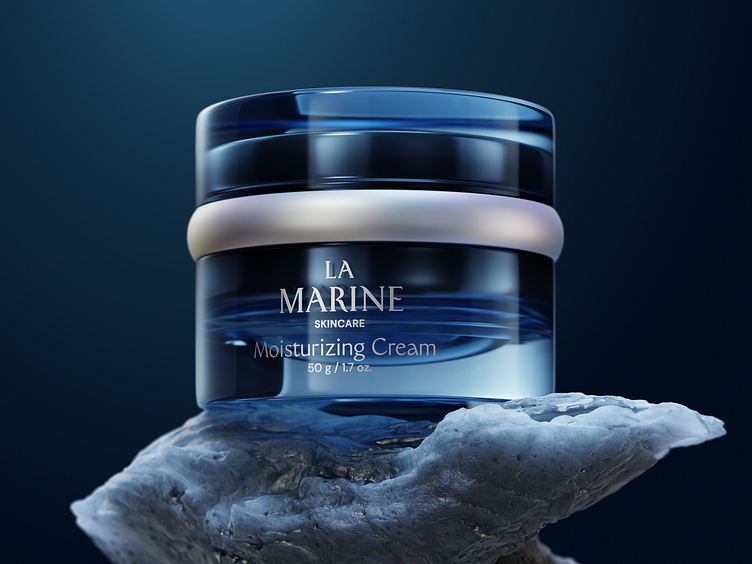
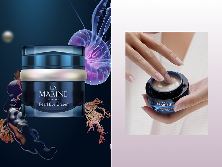
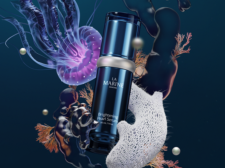
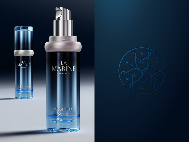
Close cooperation between our strategists and the client led to the key idea of the product to develop a chemical formula based on ocean ingredients: jellyfish extract, glass-sponge spores/micro-needles, and pearl powder. Each of the ingredients has its own effect on the skin and helps to preserve youthfulness. The first product line included “Brightening Pearl Serum” and “Moisturizing Cream”, with plans to expand and add new products in the future.
The unique chemical formula based on ocean ingredients became the basis for further development of the brand strategy, positioning, and name. The ocean is the least explored part of our planet, which was the beginning of life on Earth and holds many more secrets. “La Marine” reveals the beauty secrets of the ocean to women.
Our goal
The design team was tasked with creating a visual identity and packaging design for the first products in the line. The brand strategists set clear goals for the design team to achieve.
- Show the hero ingredients of the line. Because they are the main USP of the product and an advantage over competitors.
- Create a sense of a premium brand, "great value for money".
- To convey the essence of the brand, the atmosphere of the ocean, and the naturalness of rare cosmetics ingredients.
- Create a flexible visual system that can be easily adapted to new products.
Concept
We reveal the ocean's beauty secrets to you
While searching for a visual idea, we came across the concept of the "flower of eternal youth". In legends, fairy tales, and myths, the image of a magic flower is associated with better health, good luck, eternal youth, and beauty. So, we found a visual metaphor for our products - "we are like an ocean flower".
La Marine explores the depths to discover the secrets of beauty, just as scientists explore the ocean in search of new species. Our products are like new species of ocean flowers that we discover and bring to women as a treasure. These flowers are a magical symbol of their beauty and femininity.
They "grow" in the unexplored depths of the ocean, which emphasizes their naturalness, natural origin, and unique formula of ingredients that only our products have.
Design
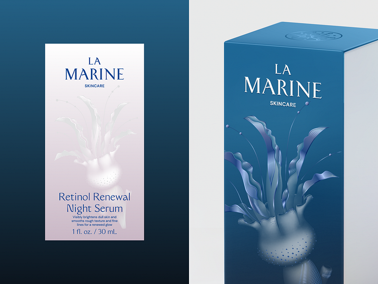
All design elements are intended to convey the metaphor of an ocean flower and create the feeling that our products have come from the depths of the ocean. For the packaging design, we opted for the mono-design concept, which facilitates the development of future products and lines.
Illustrations
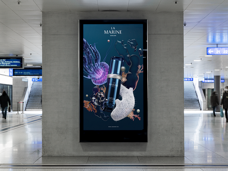
Illustration is the main visual component of the identity and packaging. This is our ocean flower, which consists of the hero ingredients of the line. We realized that a jellyfish is visually similar to a bud, a sponge to a stem, and pearls to flower stamens, so by combining all three ingredients together, we created an image of a non-existent flower. As if it was a rare flower that no one had ever seen before, and we had just found it in the depths of the ocean and offered to use its magical properties. Such an illustration is both an interesting visual image that helps to stand out from the competition and a metaphor for the product.
With the help of the illustration, we fulfill the main task - to show the hero ingredients of the line.