"CysHub" : Explore latest projects in your Community.📚✨

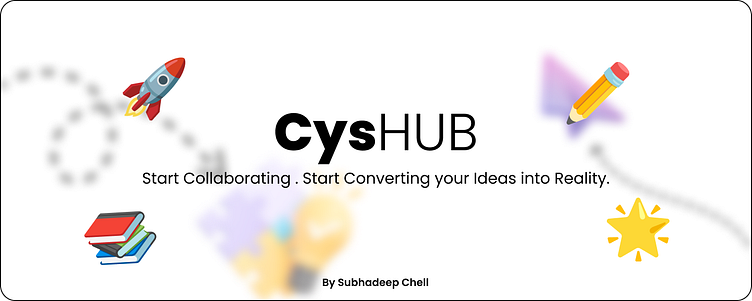
This UI design is inspired by the classic school-style design concept involving members of a tech community providing them with an easy accessible and smooth user experience of handling community projects.


As evident, the homepage's UI exhibits a vibrant color palette, encompassing hues such as red, yellow, and green. Notably, elements with high user accessibility, such as buttons, are distinguished by their utilization of a black color scheme, emphasizing their salience and prominence within the interface.🎨
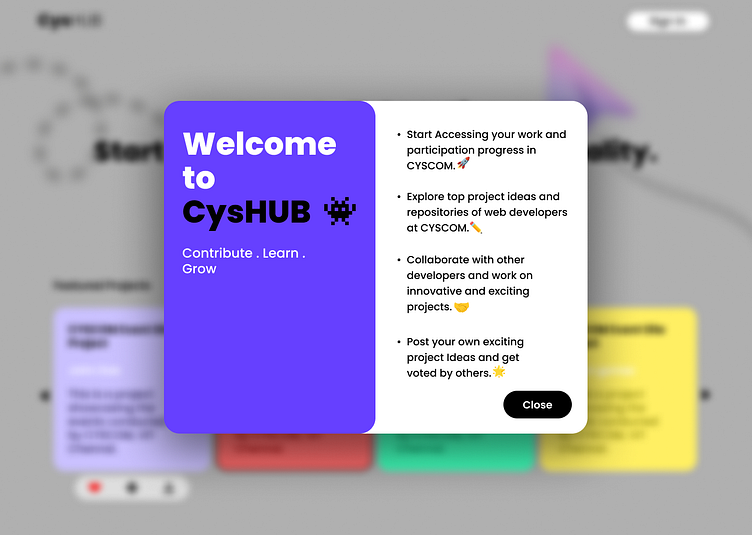
Here you get to see, the blurred background to make way for the pop-up dialog box (card) to get highlighted. Do, let me know if you like the purple shade throughout the UI?!😉✨
The overall UI is created using vibrant mix of well-defined colour palette🎨.On interaction, some of the components of the UI, change to card-based design elements. This gives a more smooth, animated and appealing user experience.❤️
📩✏️Contact me for more such modern design concepts at: sherlockx90@gmail.com
~ by Sherlock🤖