Plaid Website 2.0 Overview


Plaid's website upgrade has been slowing rolling out for the last year. Our team has put together a plan and begun rolling out a fresh, more balanced take on the brand.
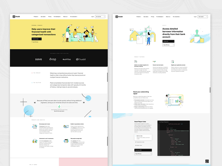

Before ^
In the past, Plaid's website felt a little too pastel and childlike. The spacing and alignment wasn't consistent and the CMS components were too static and restrictive to get creative.
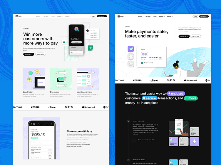
The after ^
In the past few months we've rolled out lots of new global CMS components that are flexible, scalable and modular. We've also created more contrast, toned down the pastels (while keeping the pops of color and playful bits of our brand) and introduced a new system of product shots and photography (not featured here). Overall, the impression still flows relatively seamlessly with the old webpages during this transition but brings things together in a more sophisticated way.
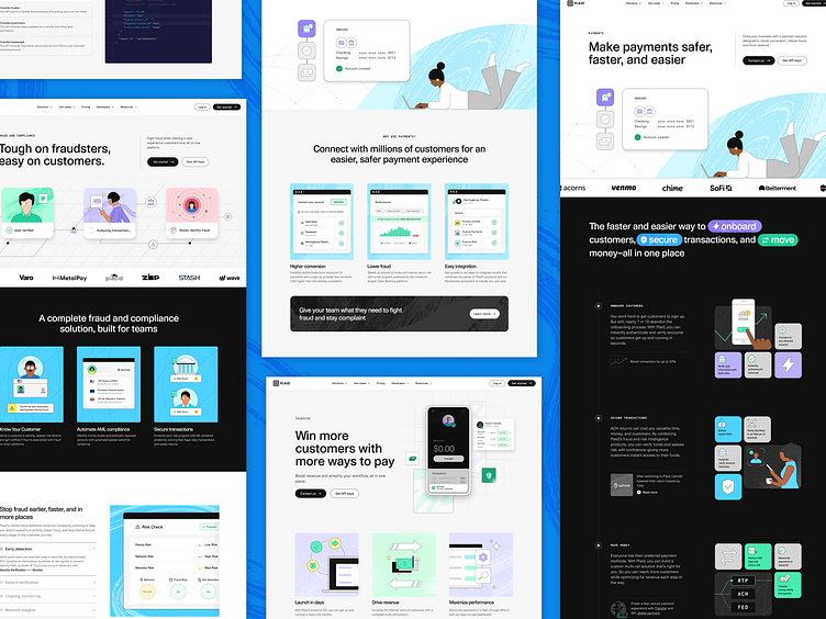
See an example of Plaid Website 2.0 on our live payments page!