Case Study: Dar Oomi – Web Design


Case Study: Dar Oomi – Web Design
CLIENT
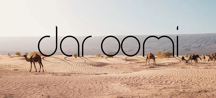
Dar Oomi
DELIVERABLES
Web Design
TEAM
ABOUT DAR OOMI
A luxury retreat full of authenticity. Dar Oomi, means my mother’s house, it’s not just a meaningless word, it’s both the spirit that inhabits the main house, but also the 7 residences that unfold around the swimming pool. All honor a woman who marked her time and history.
The challenge with this project was showcasing the epitome of luxury and elegance in the heart of Tunisia. Nestled amidst stunning landscapes and pristine beaches, this luxury hotel stands as a testament to opulence and refined hospitality.
OUR SOLUTION:
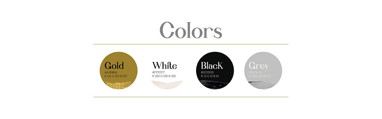
CHOOSING A SIMPLE LUXURY PALETTE:
In the realm of design, there is an art to simplicity that speaks volumes. We embraced this philosophy by curating a palette that exudes refined elegance—white, gold, and black. These three colors, when combined, create a canvas that serves as a backdrop for the vibrant and colorful soul of the hotel to truly shine.
White, with its timeless purity and tranquility, forms the foundation of this palette. It symbolizes the hotel’s commitment to offering guests a sanctuary of serenity and luxury. Gold, a symbol of opulence and grandeur, adds a touch of lavishness to the ambiance, elevating the guest experience to new heights. Black, with its sophisticated depth, adds contrast and drama, creating a sense of intrigue and allure.
The brilliance of this design strategy lies in its intention—to allow the hotel’s colorful soul to take center stage. Against the backdrop of the white, gold, and black palette, the vibrant hues that reflect the rich culture, history, and natural beauty of Tunisia burst forth with unparalleled vitality.
This palette is in perfect combination with the textures we chose, which are the main features of this magical place – the nature. Nature’s beauty often serves as the greatest muse for design, and this luxury hotel draws inspiration from the serene surroundings of Tunisia.
COMPLIMENTED BY TYPOGRAPHY:
A Tale of Elegance and Simplicity. In the world of design, typography is a language that speaks to the soul of a brand. We’ve has skillfully harnessed the power of typography to create an enchanting narrative.
For the headers and focal points, a statement font, named Willona Vissta was selected. This font exudes sophistication, luxury, and a touch of grandeur. Its elaborate strokes and graceful curves catch the eye, commanding attention and setting the stage for the narrative that follows. This font resonates with the hotel’s commitment to providing a bespoke and lavish experience to its discerning guests. Each header becomes a visual masterpiece, drawing guests into the allure of the hotel’s offerings. As a complimentary font for small headers was chosen Bodoni Moda Regular.
Contrasting with the statement font, we used the simple and elegant Roboto Slab Regular for the majority of texts. Its easy readability ensure that information is conveyed seamlessly to the guests. This font’s simplicity doesn’t just enhance legibility; it also allows the hotel’s rich content to take center stage. It becomes the canvas on which the hotel’s story, services, and amenities are elegantly painted.
By juxtaposing these two fonts, we have achieved a harmonious balance. The statement font captures attention, while the simple font offers clarity, allowing guests to navigate the hotel’s offerings effortlessly.
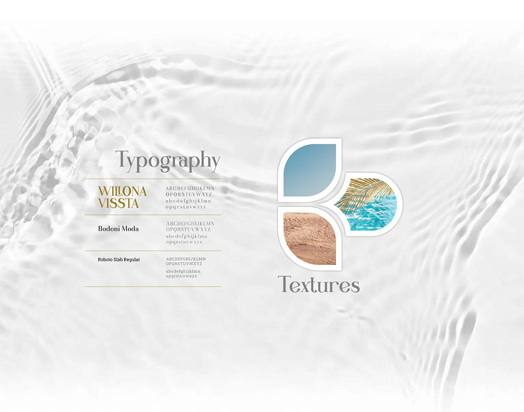
TEXTURES:
In the textures we chose to use the main features of this magical place – the nature. Nature’s beauty often serves as the greatest muse for design, and this luxury hotel draws inspiration from the serene surroundings of Tunisia.

ICONOGRAPHY:
A Visual Language of Simplicity. The design philosophy of this luxury hotel embraces the power of simplicity through outlined icons—a visual storytelling technique that complements the elegance of the brand. The beauty of outlined icons lies in their ability to transcend language barriers. Guests from all corners of the world can effortlessly navigate the website, selecting their desired experiences without the need for extensive reading. The icons create an uncluttered interface, allowing visitors to explore the hotel’s offerings with ease, enhancing engagement and encouraging further exploration.
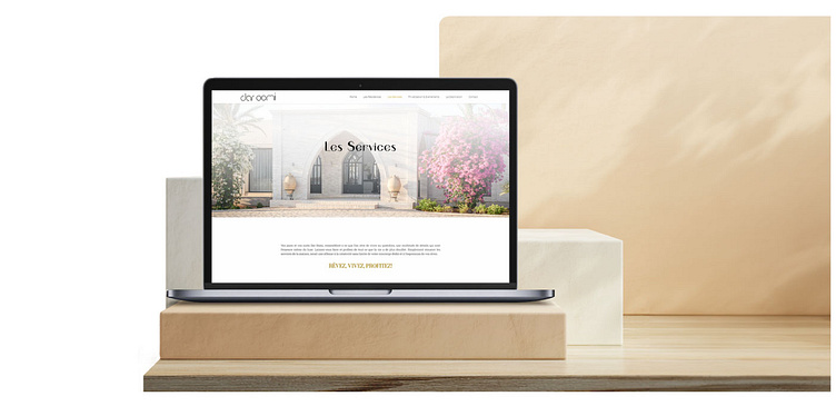
The website of this luxury hotel stands as a digital canvas that intricately weaves together visuals, information, and interactivity to offer an immersive preview of the hotel’s opulent offerings.
